The Ritz-Carlton
Year
2023
Role
Lead Visual Designer
Platform
Responsive web
Focus
Visual storytelling, Editorial layout, Brand experience, Content-driven design
Team
Design, Marketing, Content, Engineering
The Ritz-Carlton digital experience was designed to translate the brand’s luxury, editorial voice, and storytelling approach into a modern web experience. The goal was to move away from a traditional hotel booking website and instead create a platform that inspires users through stories, destinations, and experiences, while still supporting booking and exploration.
The Challange /
My Role
The main challenge was balancing inspiration with usability. Luxury hospitality websites often focus heavily on imagery and storytelling, but users still need clear navigation, destination discovery, and booking functionality. The design needed to feel editorial and immersive while still functioning as a scalable, usable platform across multiple destinations and content types.
I led the visual and interaction design across key pages and components, including the homepage, editorial layouts, destination features, and content modules. I developed the design system, typography hierarchy, layout structure, and interaction patterns, and worked closely with UX, product, and development teams to ensure the experience was both visually compelling and technically scalable.
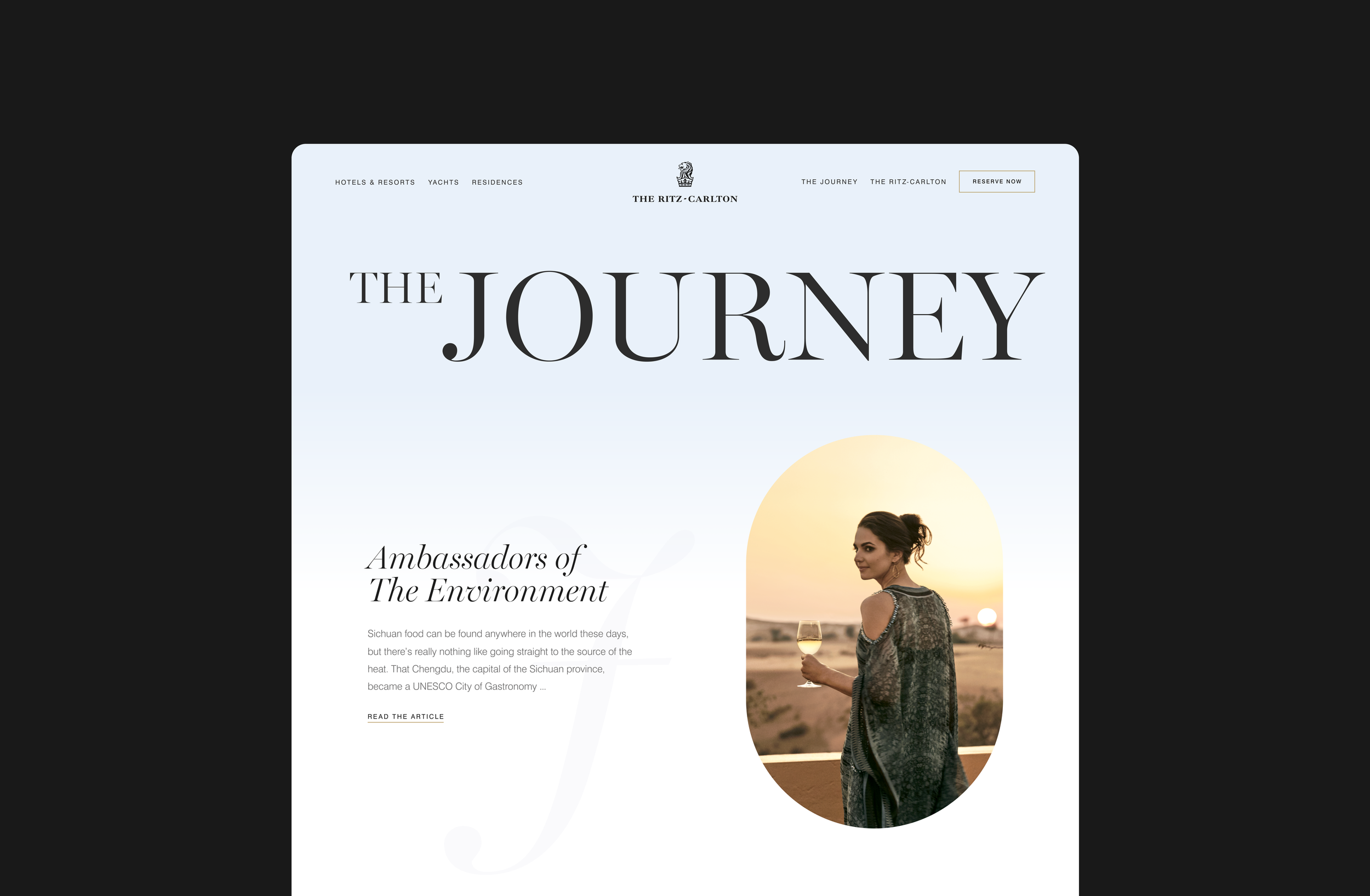
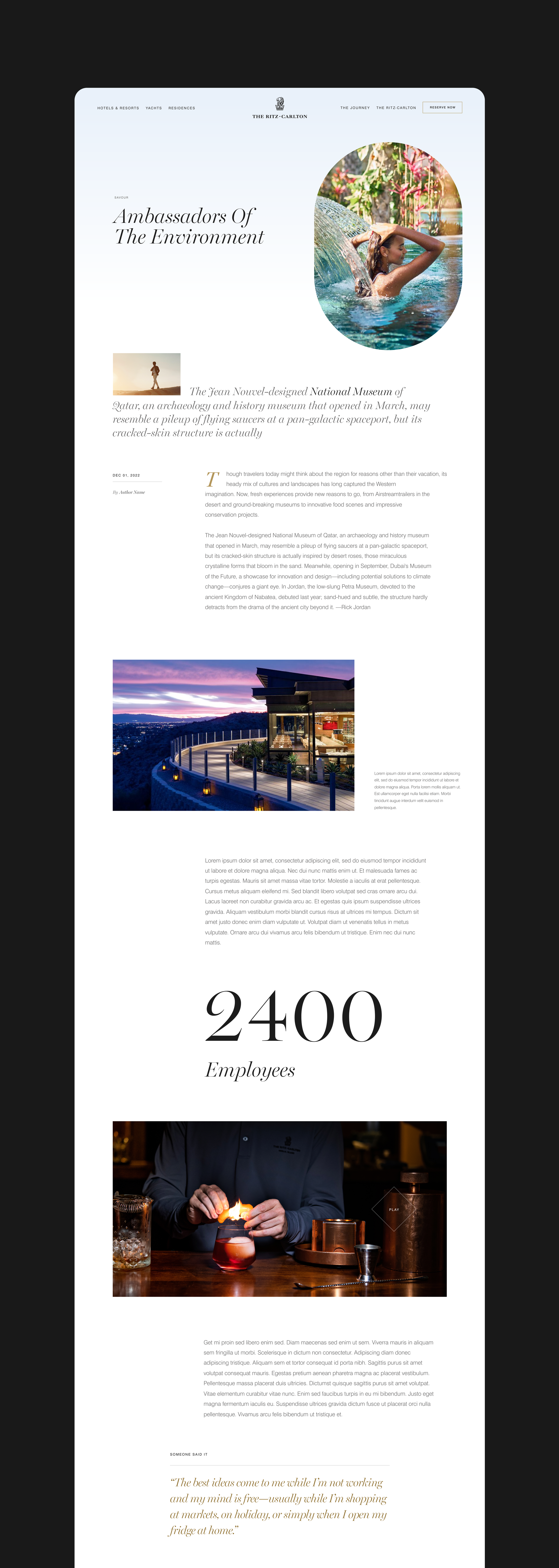
Editorial Story Section
This section was designed like a digital magazine, combining large serif headlines, editorial layouts, and immersive imagery. The asymmetrical composition creates rhythm while guiding the user through stories, destinations, and experiences in a narrative flow rather than a traditional grid.
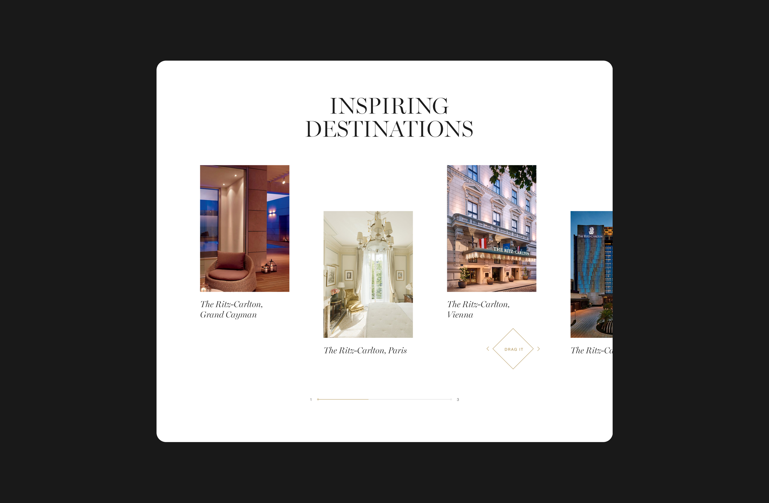
Location Carousel
The location carousel was designed to showcase destinations in a curated and interactive way. Instead of a standard slider, the layout uses spacing, typography, and subtle motion to create a gallery-like browsing experience. This allows users to explore destinations visually while keeping the interface minimal and elegant, consistent with the overall luxury aesthetic.
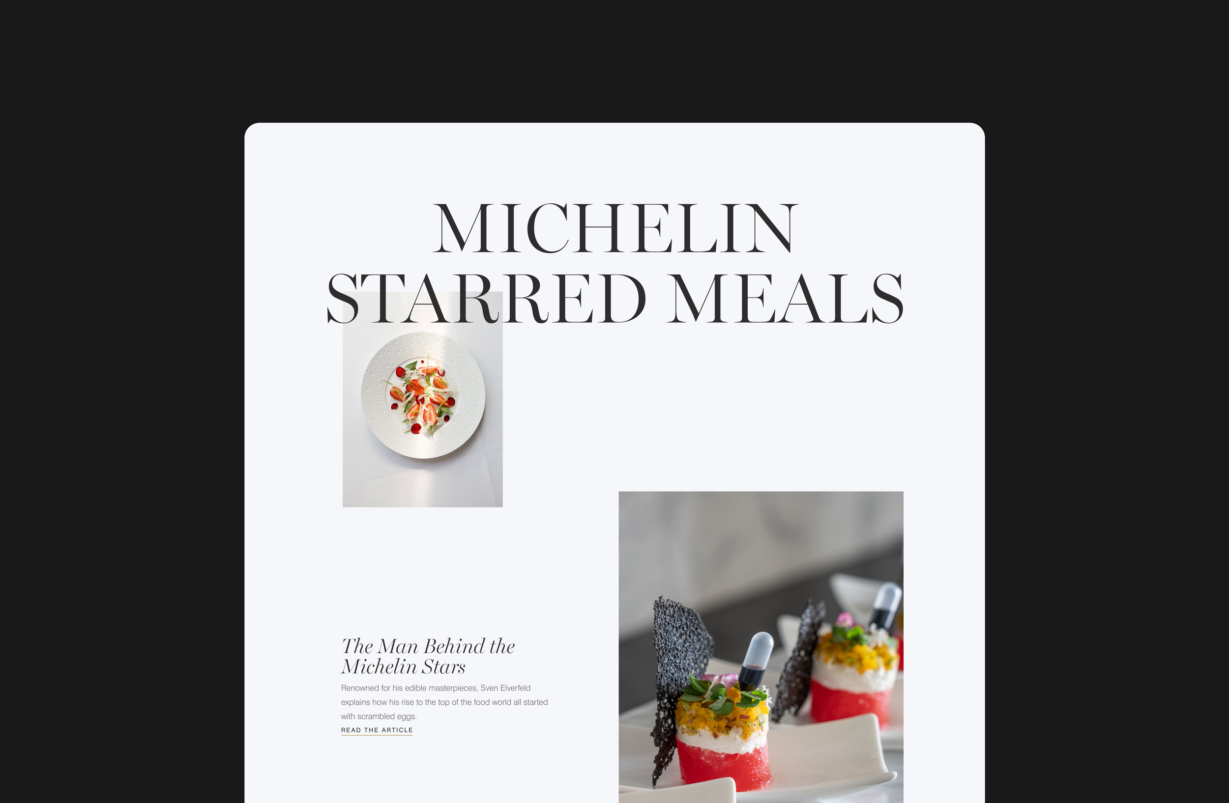
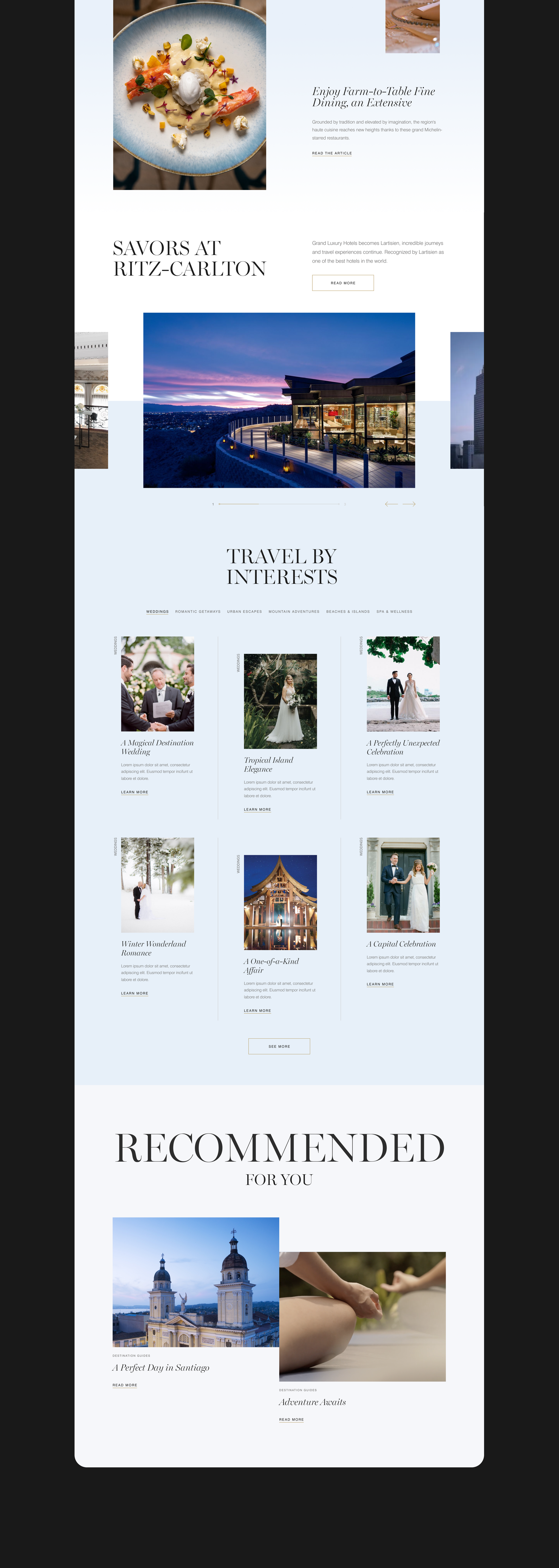
Editorial Feature Section
This section was designed as a visual editorial feature to highlight culinary experiences in a more expressive and story-driven way. The oversized typography creates a strong visual statement, while the offset image layout introduces rhythm and hierarchy across the page. Rather than using a standard grid, the composition uses scale and white space to guide the user’s eye between headline, imagery, and story content, reinforcing the premium and editorial nature of the experience.
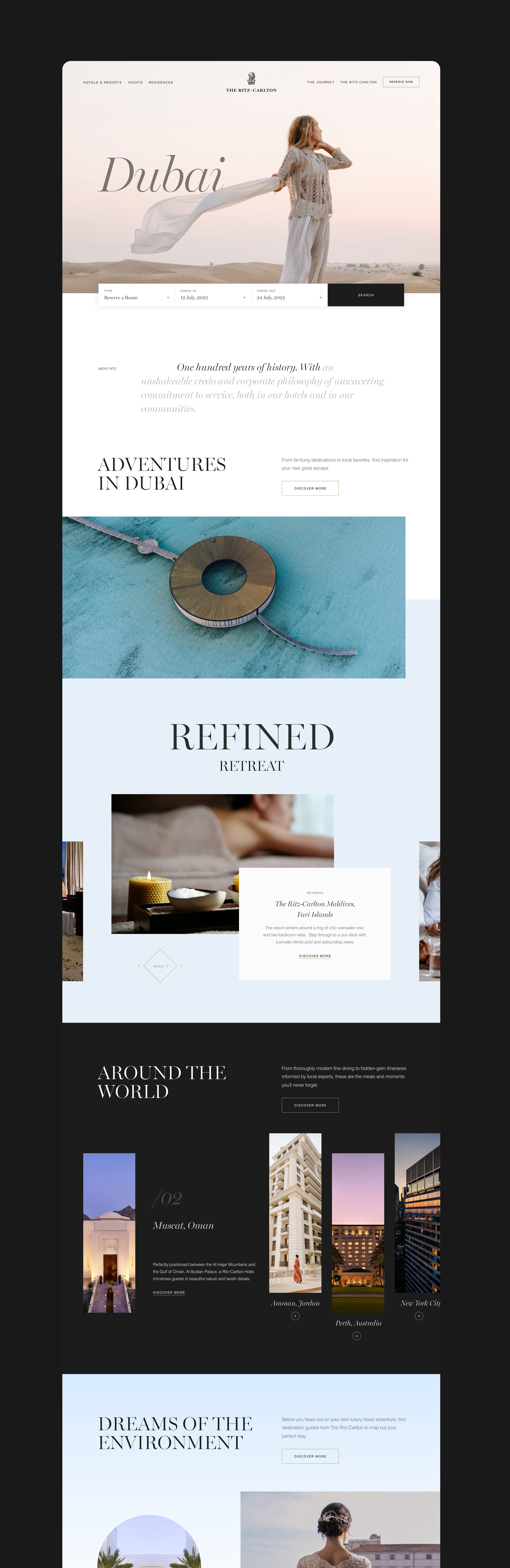
Home Page
The homepage was designed as a storytelling experience rather than a traditional hotel website. The layout moves from a strong destination-focused hero with integrated booking, into editorial-style sections that highlight experiences, destinations, and stories. Large typography, layered imagery, and alternating light and dark sections create rhythm and guide the user through the page. The structure gradually transitions from inspirational content to more functional sections like destinations, interests, and recommendations, helping users move naturally from discovery to planning and booking.
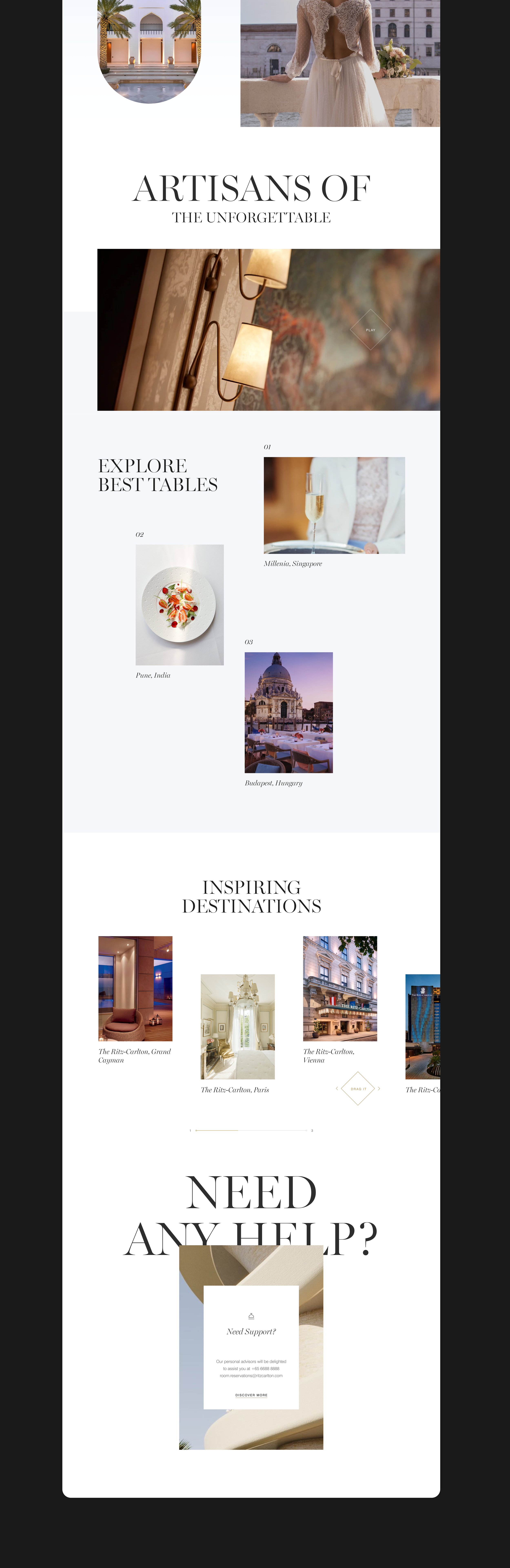
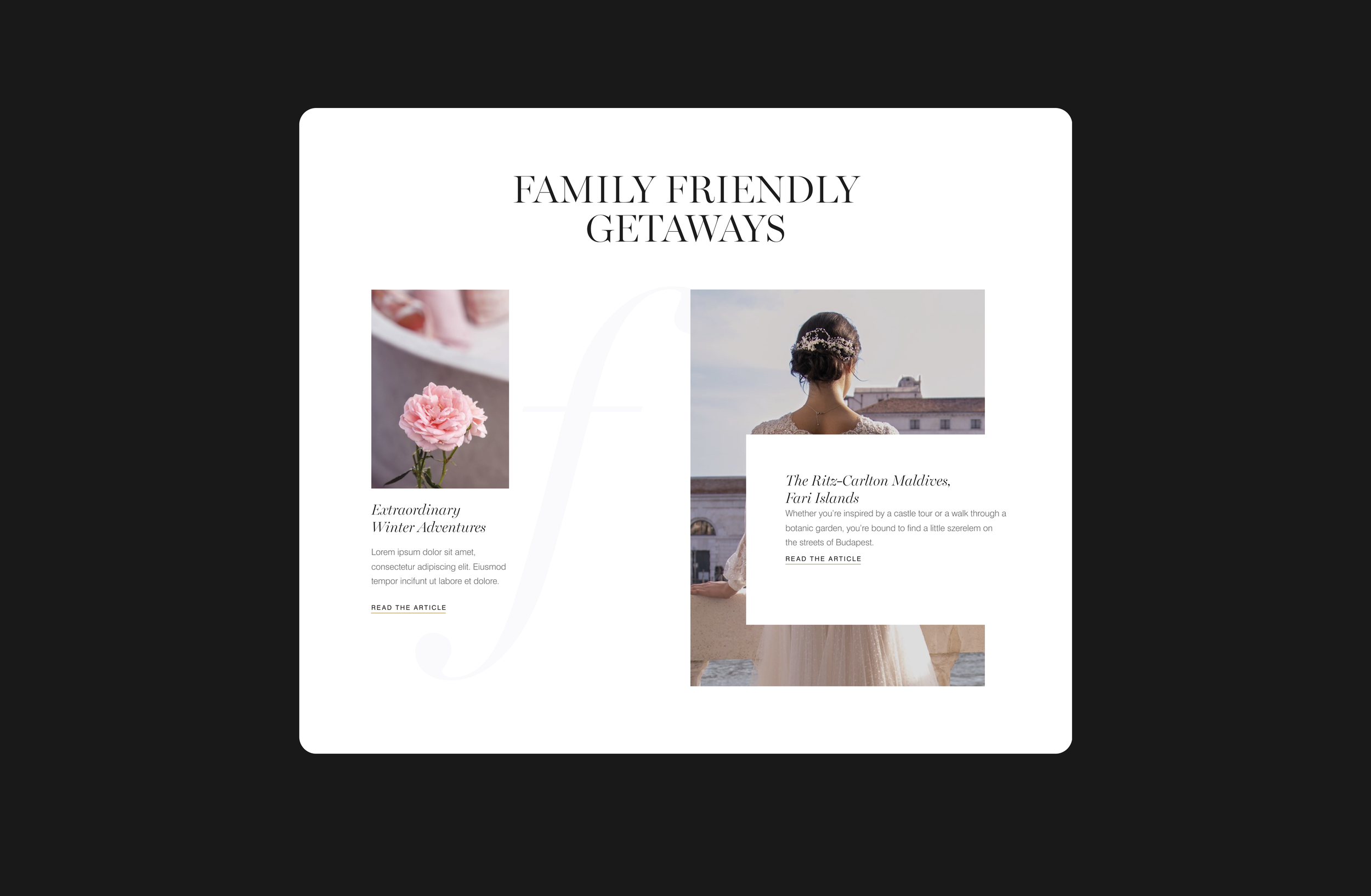
Editorial Card Section
This section was designed to present curated experiences in a more editorial and storytelling-focused layout. Instead of a traditional grid, the composition uses overlapping cards, large imagery, and generous white space to create hierarchy and draw attention to featured content. The layout allows one primary story to be highlighted while supporting articles remain visible, encouraging exploration while maintaining a refined and elegant visual structure.
Article Page
The article page is designed for readability and storytelling. Large imagery, generous white space, and elegant typography create a calm reading experience, shifting the focus from browsing to immersive content consumption.
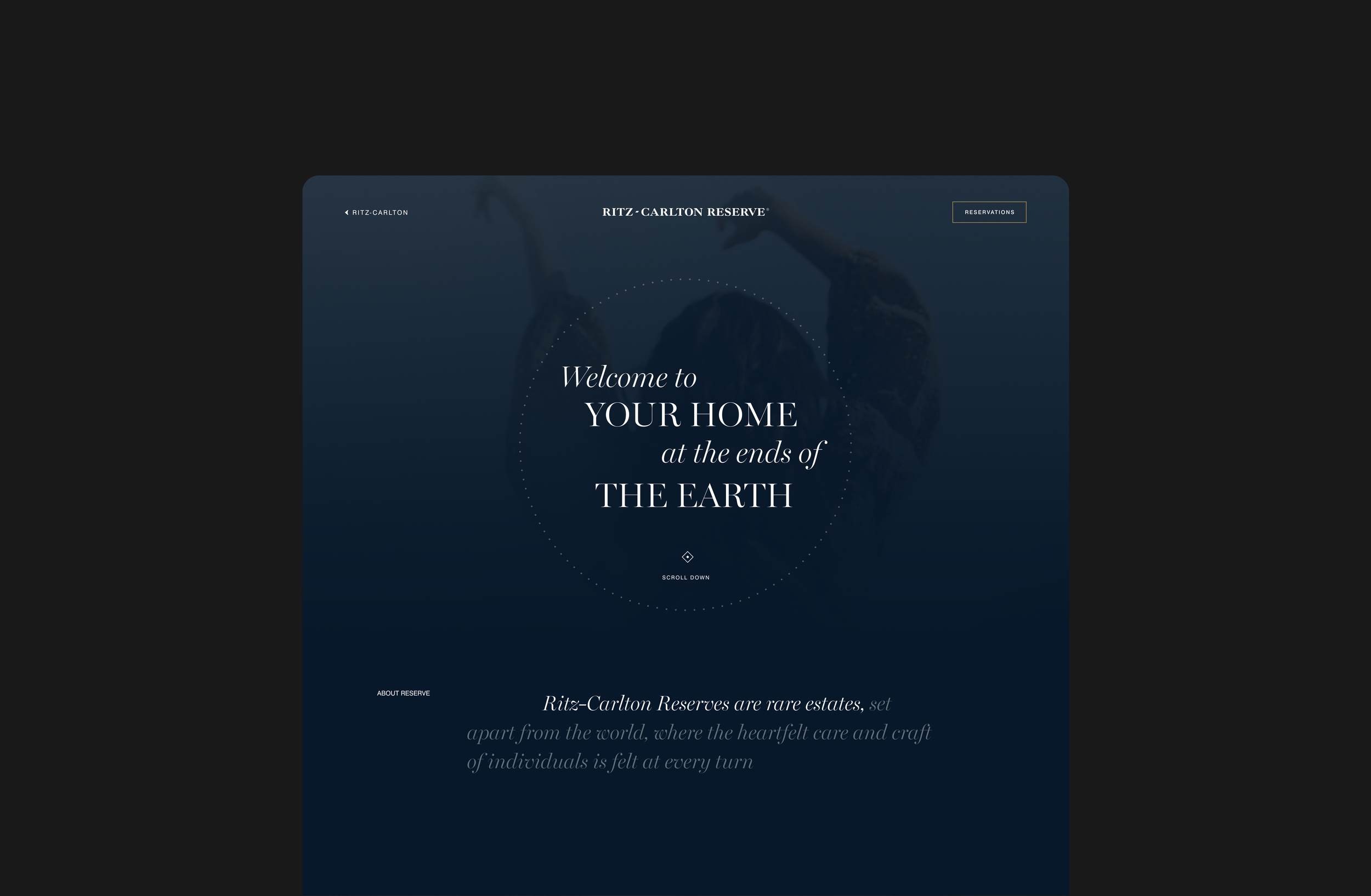
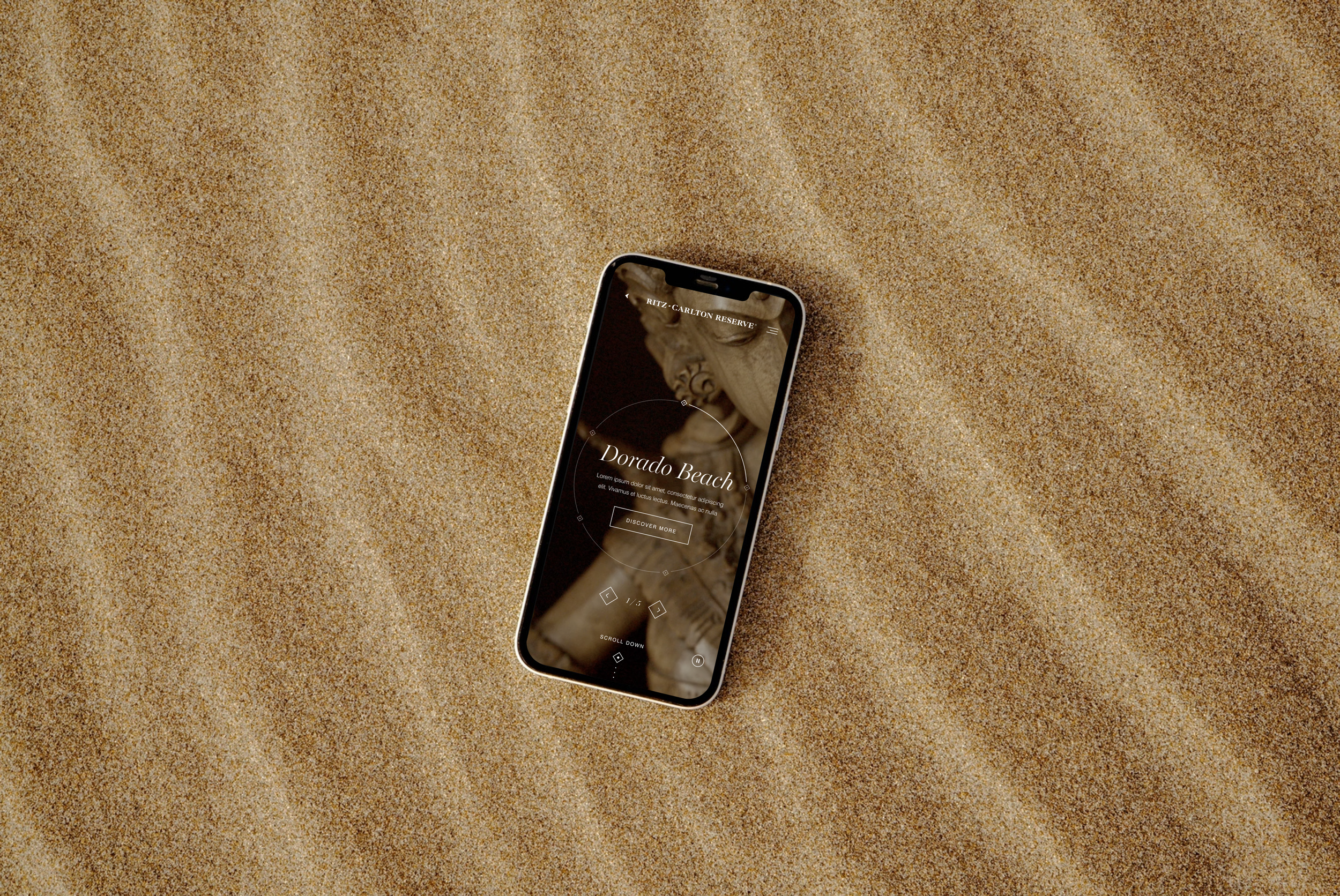
Reserve / Property Page
This page uses darker tones, centered typography, and minimal UI to create a more intimate and premium feeling. The circular navigation element reinforces the idea of exploring destinations in a more interactive and emotional way rather than through standard navigation.
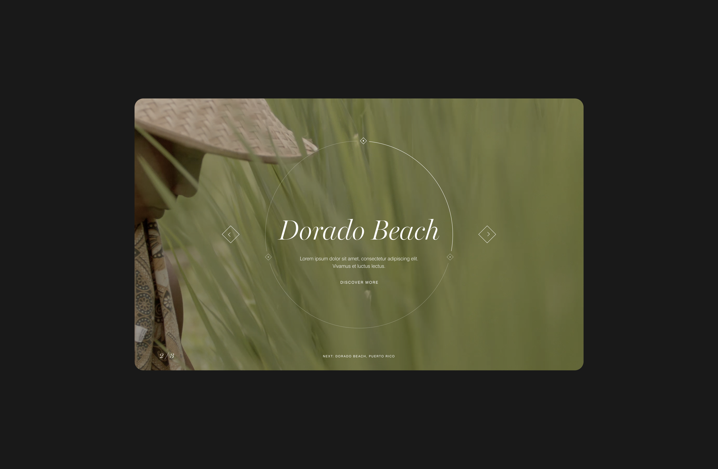
Destination Feature Carousel
This component was designed as an immersive destination feature rather than a standard image slider. The centered typography and circular navigation element create a strong focal point, while subtle motion and large imagery allow destinations to feel atmospheric and cinematic. The interaction encourages users to explore locations one by one, focusing on discovery and storytelling rather than quick browsing.