Microsoft Surface
Year
2023
Role
Lead Visual Designer
Platform
Responsive web
Focus
Product storytelling, Interactive web experience, Component system
Team
Design, Marketing, Engineering teams
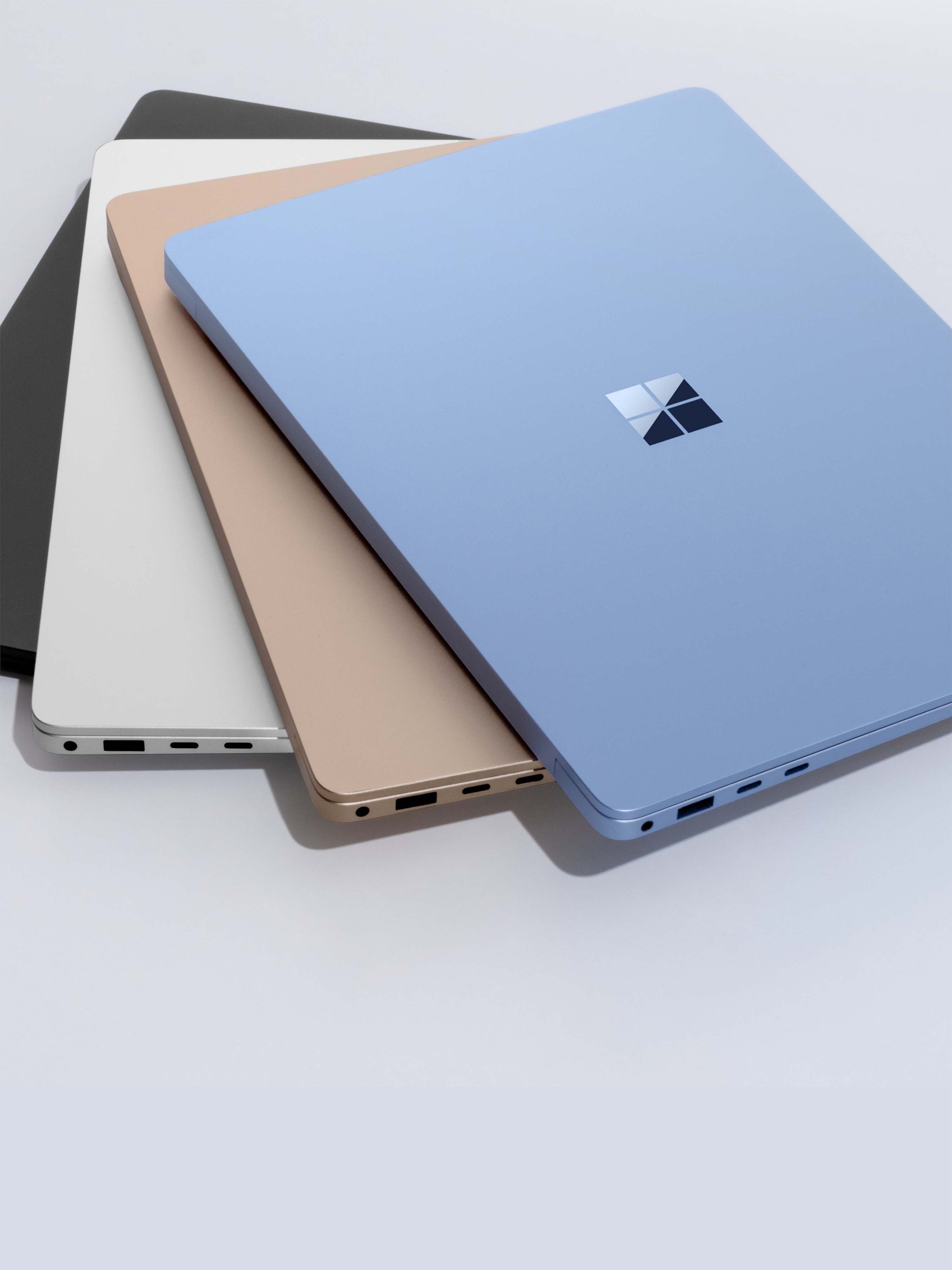
This project focused on designing a product storytelling experience for Microsoft Surface that communicates hardware innovation through a visually driven digital narrative. The goal was to translate technical product features into a clear, engaging web experience using layout, typography, motion, and composition as primary storytelling tools. The experience combines product marketing with interactive storytelling, allowing users to explore features, understand use cases, and discover the broader Surface ecosystem through a cohesive visual system.
The Challenge
The main challenge was communicating complex hardware features and technical capabilities in a way that felt clear, engaging, and visually compelling. The experience needed to balance product storytelling with technical information, ensuring that the page felt expressive and dynamic without losing clarity or usability. Another challenge was creating a flexible layout system that could support a wide range of content types, including product features, performance metrics, accessories, and industry use cases, while maintaining a consistent visual language across the entire experience.
My Role was;
I led the visual and interaction design for the experience, focusing on layout composition, typographic hierarchy, motion direction, and component design. I developed a flexible visual system that could shift between expressive product storytelling and more structured informational sections. I worked closely with product, marketing, and development teams to ensure the designs translated effectively into a responsive web experience while maintaining visual quality and performance.
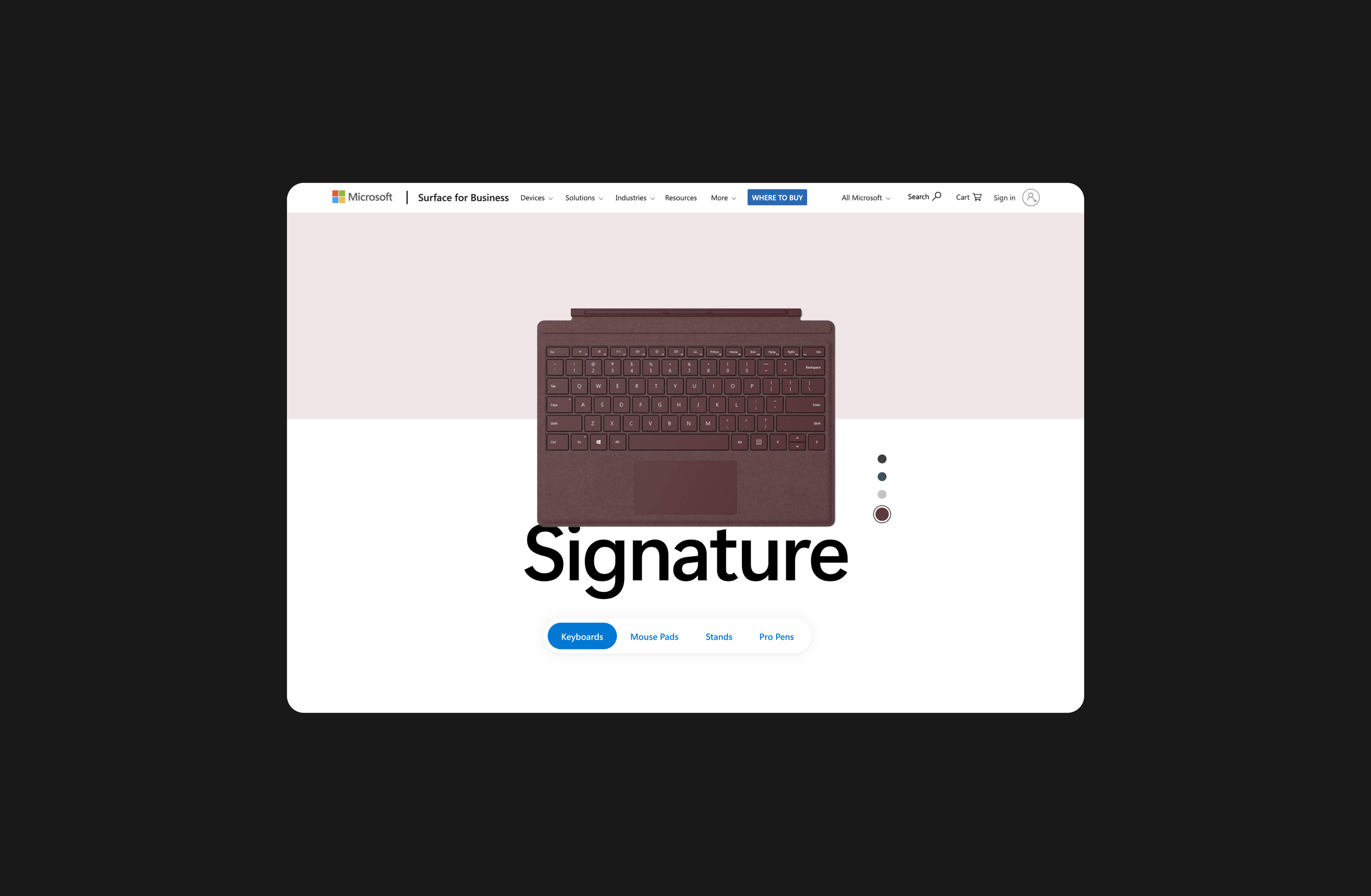
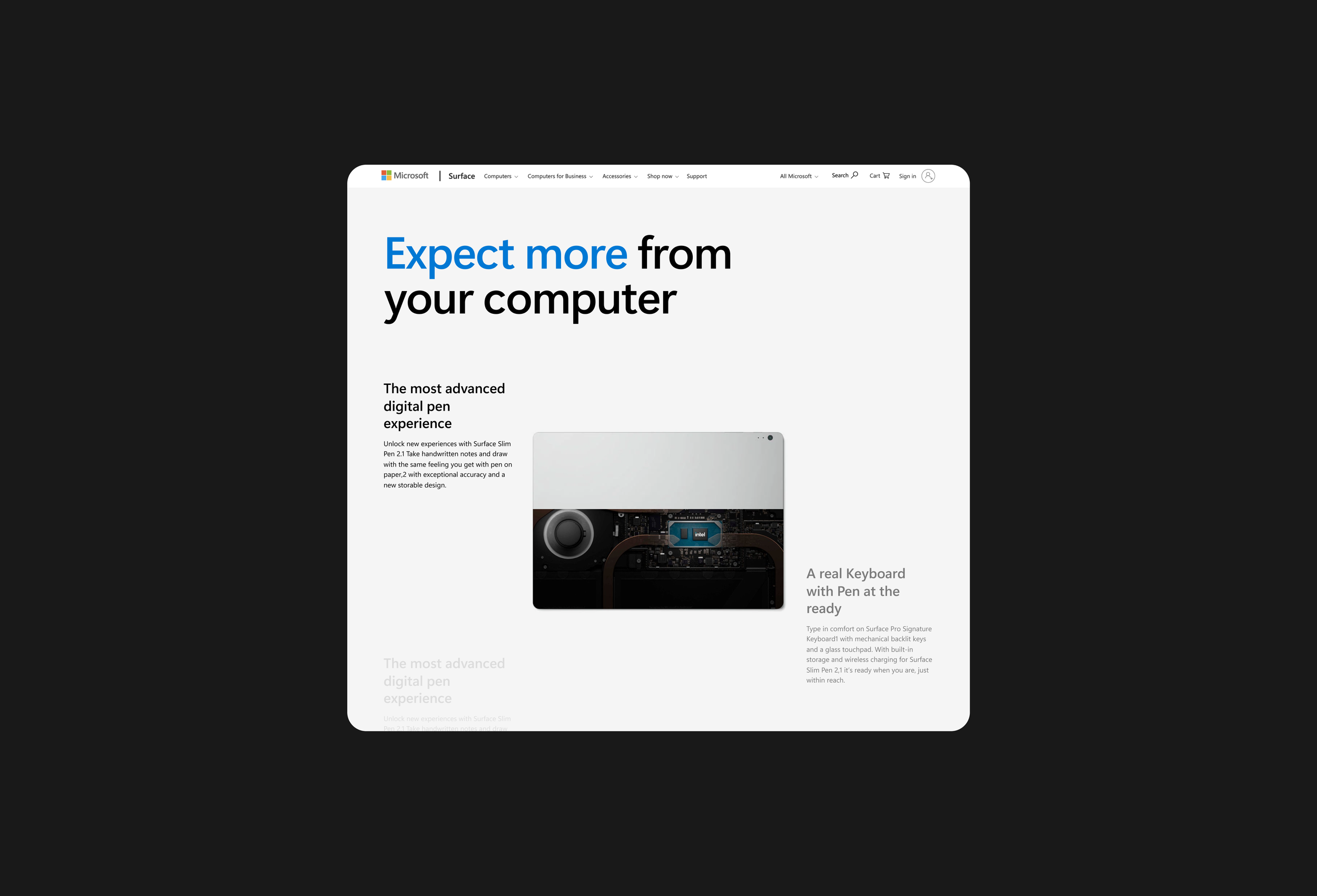
Visual Focus & Product Framing
This screen introduces the Signature Keyboard as part of the Surface ecosystem rather than as a standalone accessory. The layout centers the product in a calm, minimal environment, allowing material, color, and form to become the primary visual focus. Large typography anchors the composition and creates a clear entry point, while the soft background split helps separate product navigation from product storytelling. The overall composition is intentionally quiet, allowing the product to feel precise, tactile, and premium
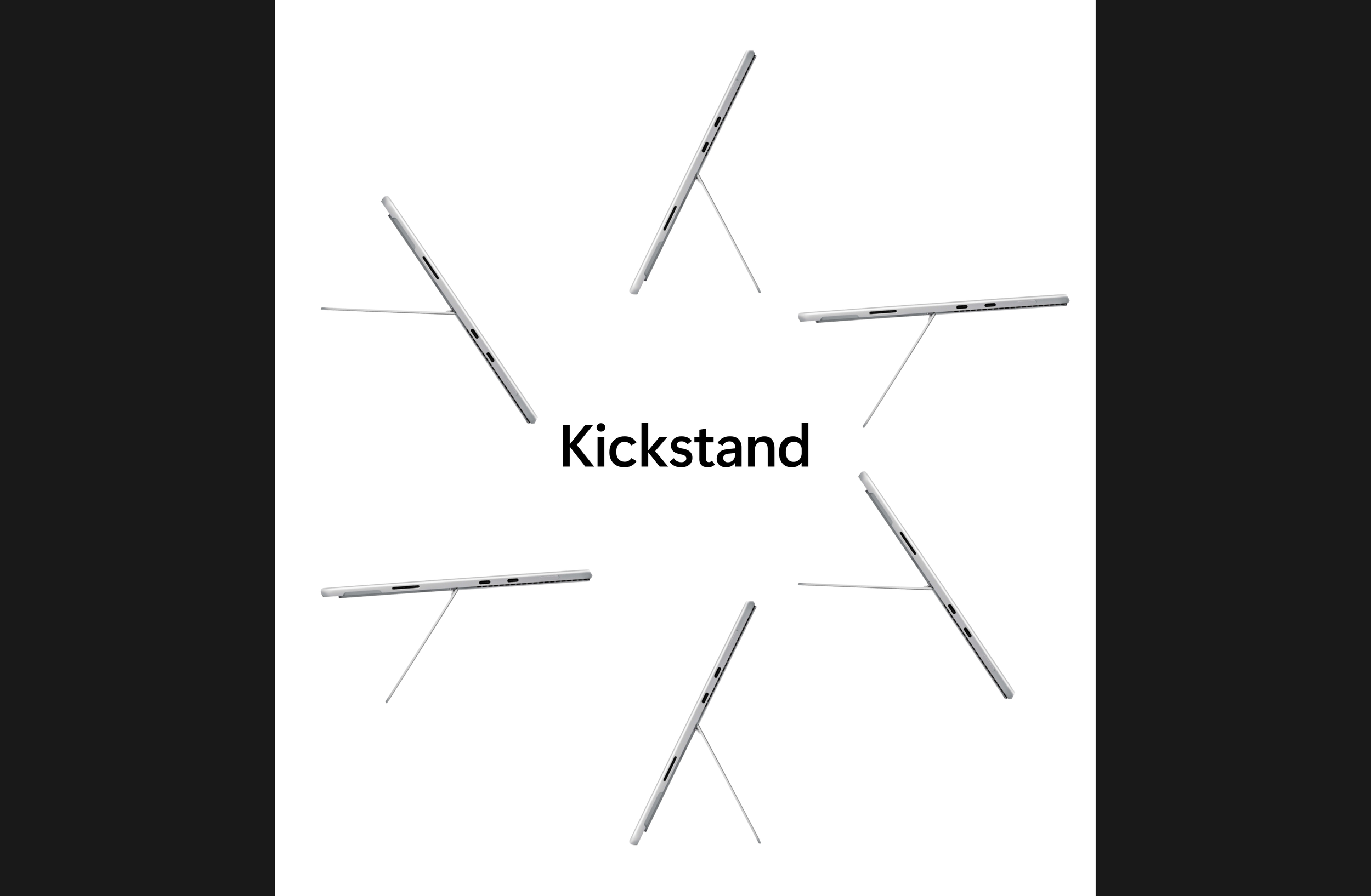
Motion & Form Exploration
The Kickstand section focuses on form and engineering through repetition and motion. Multiple device positions are arranged radially to visually communicate flexibility and range of motion without relying on heavy text. The composition turns a functional feature into a visual story, where the product itself becomes the graphic element. The minimal layout and generous negative space help emphasize precision and industrial design quality.
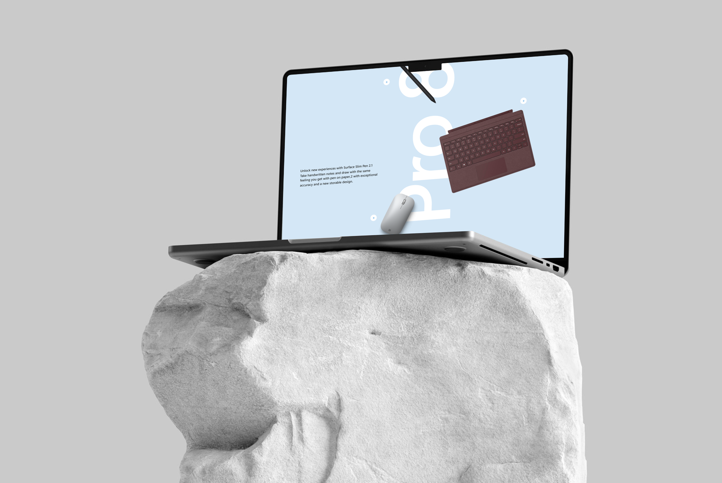
Narrative Feature Section
This section uses strong typographic hierarchy and an editorial layout to communicate product features in a clear, visual way. The large headline acts as the primary focal point, while supporting copy and product imagery are arranged in an asymmetrical grid to create movement and balance. Color is used selectively to guide attention, and the layout allows users to quickly connect the message with the product, turning technical information into a simple visual narrative.
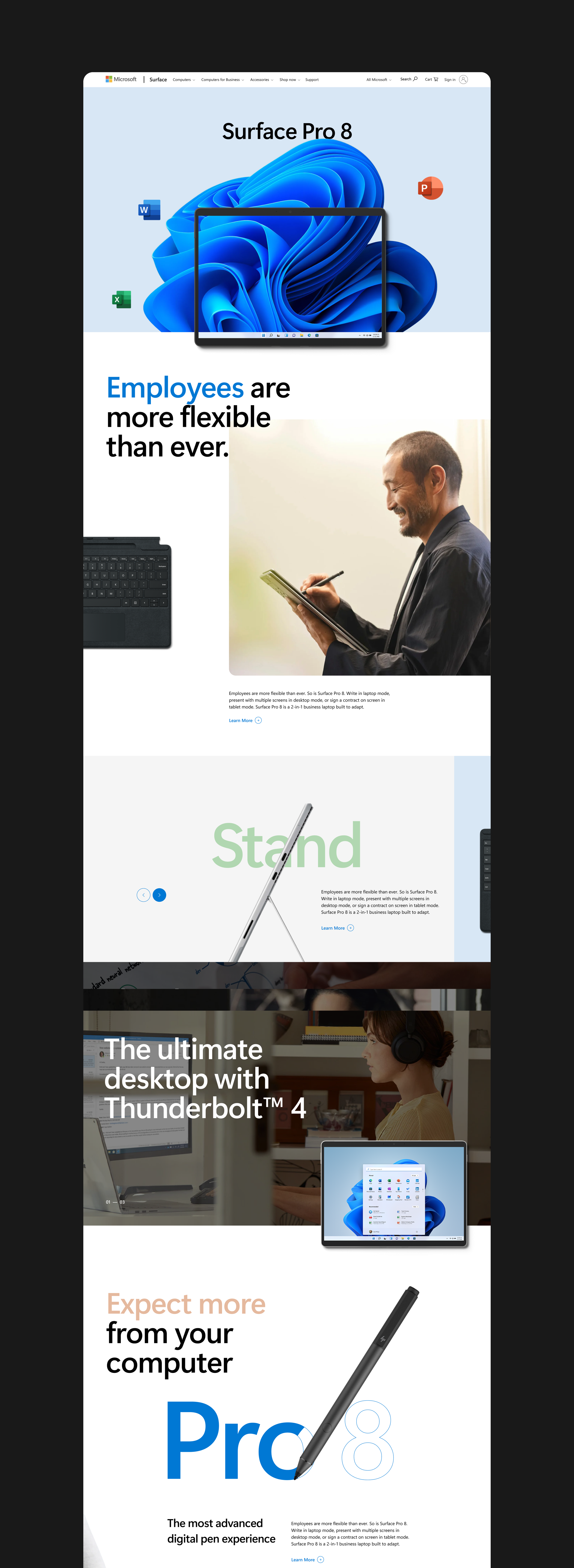
Product Storytelling
The page transitions into a layered storytelling approach where content alternates between bold statements and supporting visuals. Large type blocks, soft color backgrounds, and overlapping elements create depth and rhythm, guiding users through the narrative while maintaining a consistent visual system.
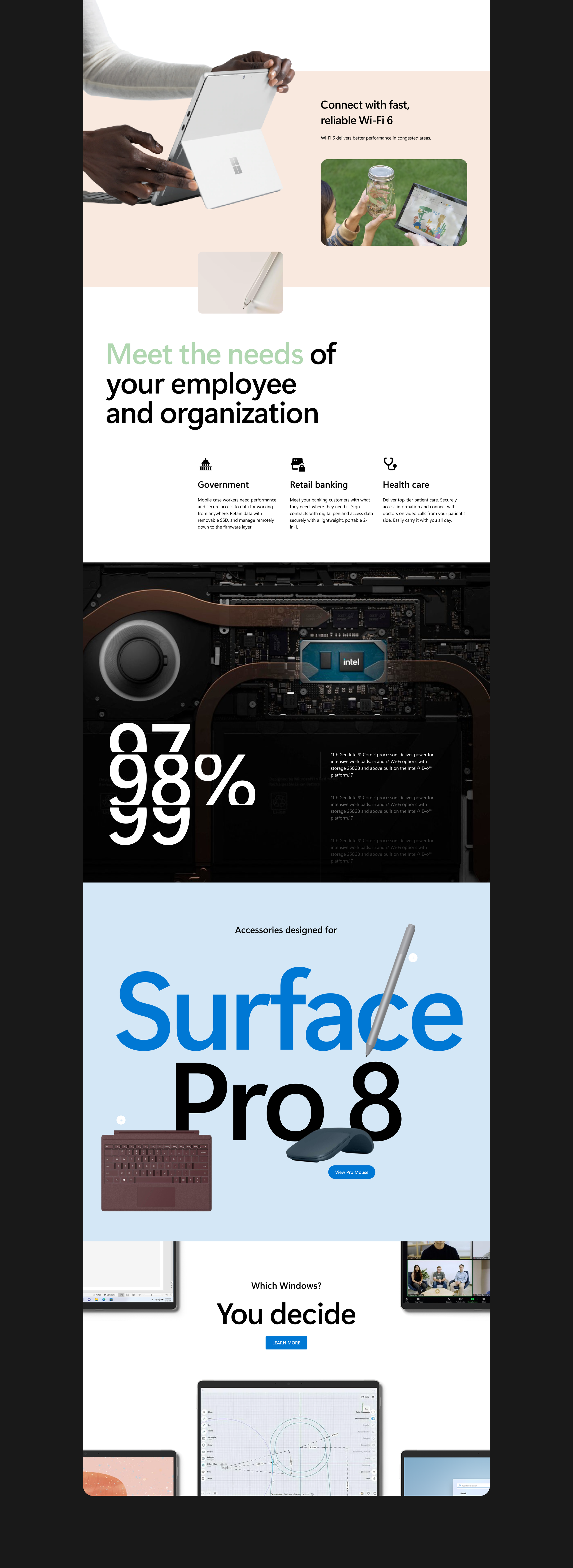
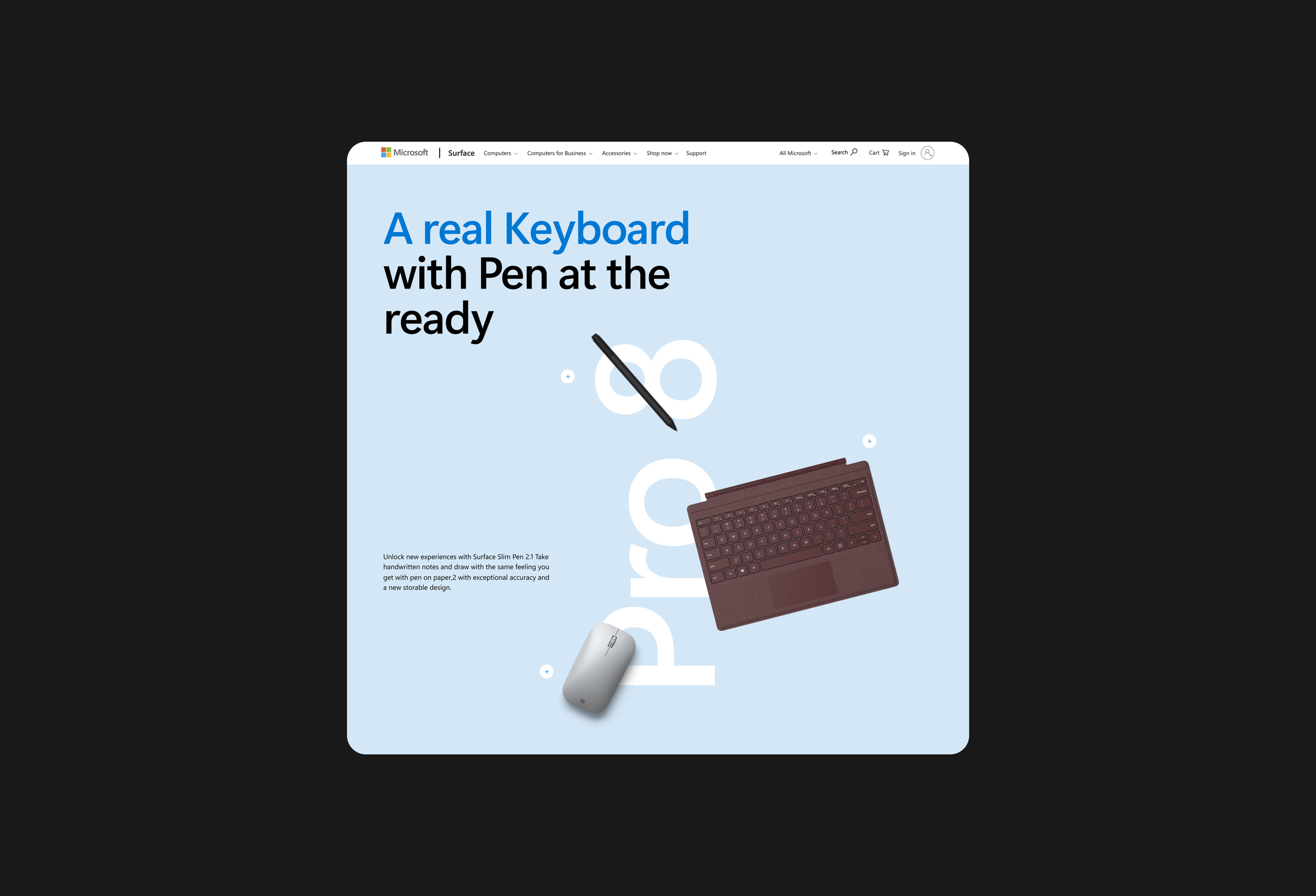
Ecosystem Presentation
This section presents accessories as part of a larger ecosystem. Products are arranged in a floating composition, allowing each accessory to be visible while still feeling part of a system. Large typography in the background creates depth and reinforces product naming without competing with the products themselves.
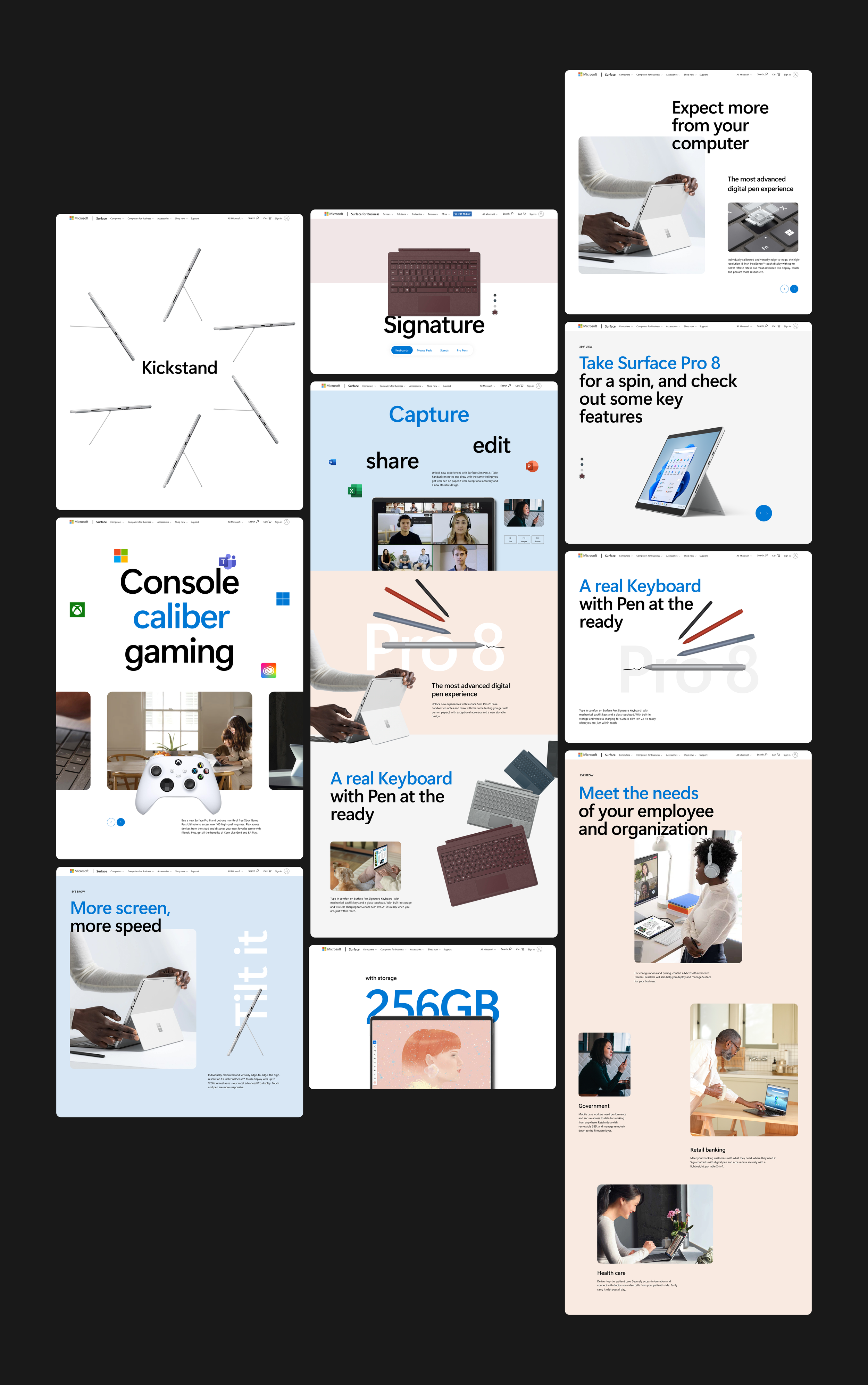
Modular System Overview
Across all screens, the design is built on a modular system that allows layouts to shift between expressive, editorial compositions and structured, information-driven sections. Consistent typography, spacing, and color usage ensure cohesion, while flexible components allow the experience to adapt across different content types and screen sizes.