Equinox Website
Year
2025
Role
Lead Visual Designer
Platform
Responsive web
Focus
Website redesign, Component system, Marketing pages, Membership flows
Team
Marketing, Product, Engineering, Content teams
The Equinox website functions as both a brand experience and a product platform. It needs to communicate the brand’s premium positioning while also helping users explore clubs, understand membership options, discover classes, and ultimately convert into members. The project focused on redesigning key parts of the web experience to create a more cohesive, scalable, and visually elevated platform that could support multiple types of content and user journeys.
The Challenge
One of the main challenges was that the website needed to serve very different user needs at the same time. New users visit the site to understand what Equinox is and what makes it different, while existing users often come to explore clubs, classes, or specific services. The platform also needed to support marketing campaigns, new club launches, and promotional content without breaking the overall structure of the site.
This meant the design system had to be flexible enough to support storytelling, but structured enough to support usability and conversion. The challenge was not just designing pages, but designing a system that could scale across many different types
of content and use cases.
This meant the design system had to be flexible enough to support storytelling, but structured enough to support usability and conversion. The challenge was not just designing pages, but designing a system that could scale across many different types of content and use cases.
My Role
I led the visual and interaction design across key parts of the web experience, defining the layout system, typographic hierarchy, component structure, and overall visual language. I worked closely with product, marketing, and engineering teams to ensure the design system could support both brand storytelling and functional user flows such as membership exploration and club discovery.
In addition to designing individual pages, I focused on building a scalable system that could be reused across different types of content and future campaigns, ensuring long-term consistency across the platform.
Responsive Approach
The platform was designed as a responsive system that preserves hierarchy, readability, and visual balance across screen sizes. Layouts are built on a flexible grid and modular components that reflow from multi-column desktop layouts into more focused, single-column mobile experiences. This ensures that complex content such as membership plans, club details, and editorial sections remain clear and easy to navigate regardless of device.
Adaptive Experience
In addition to being responsive, the experience adapts to different user contexts and content needs. On desktop, the design supports exploration and comparison through wider layouts and richer content modules, while on mobile, the experience becomes more task-focused, prioritizing key information and primary actions. This adaptive approach allows the platform to support both browsing and conversion behaviors across different devices and user scenarios.
Approach
The approach was to create a modular layout system built on a strong grid, consistent spacing, and a clear typographic hierarchy. Pages are constructed from flexible content blocks that can be rearranged depending on the content type. This allows the same system to be used for club pages, membership pages, class pages, and campaign landing pages while still feeling cohesive.
Large imagery and bold typography are used to communicate the brand and create an emotional connection, while structured content sections provide the practical information users need to make decisions. This balance between emotional storytelling and functional clarity became a core principle throughout the design process.
Visual Design System
The visual design system is intentionally minimal and editorial. The color palette is restrained, allowing photography and content to take focus. Typography plays a major role in the design, using large headlines and generous spacing to create a sense of confidence and clarity.
The grid system and spacing rules were designed to create consistency across pages while still allowing flexibility in layout composition. Components such as content cards, plan comparison modules, image grids, and feature sections were designed as reusable elements that could work across multiple page types.
Motion is used subtly throughout the experience to guide attention, create transitions between sections, and make the experience feel more dynamic without overwhelming the content.
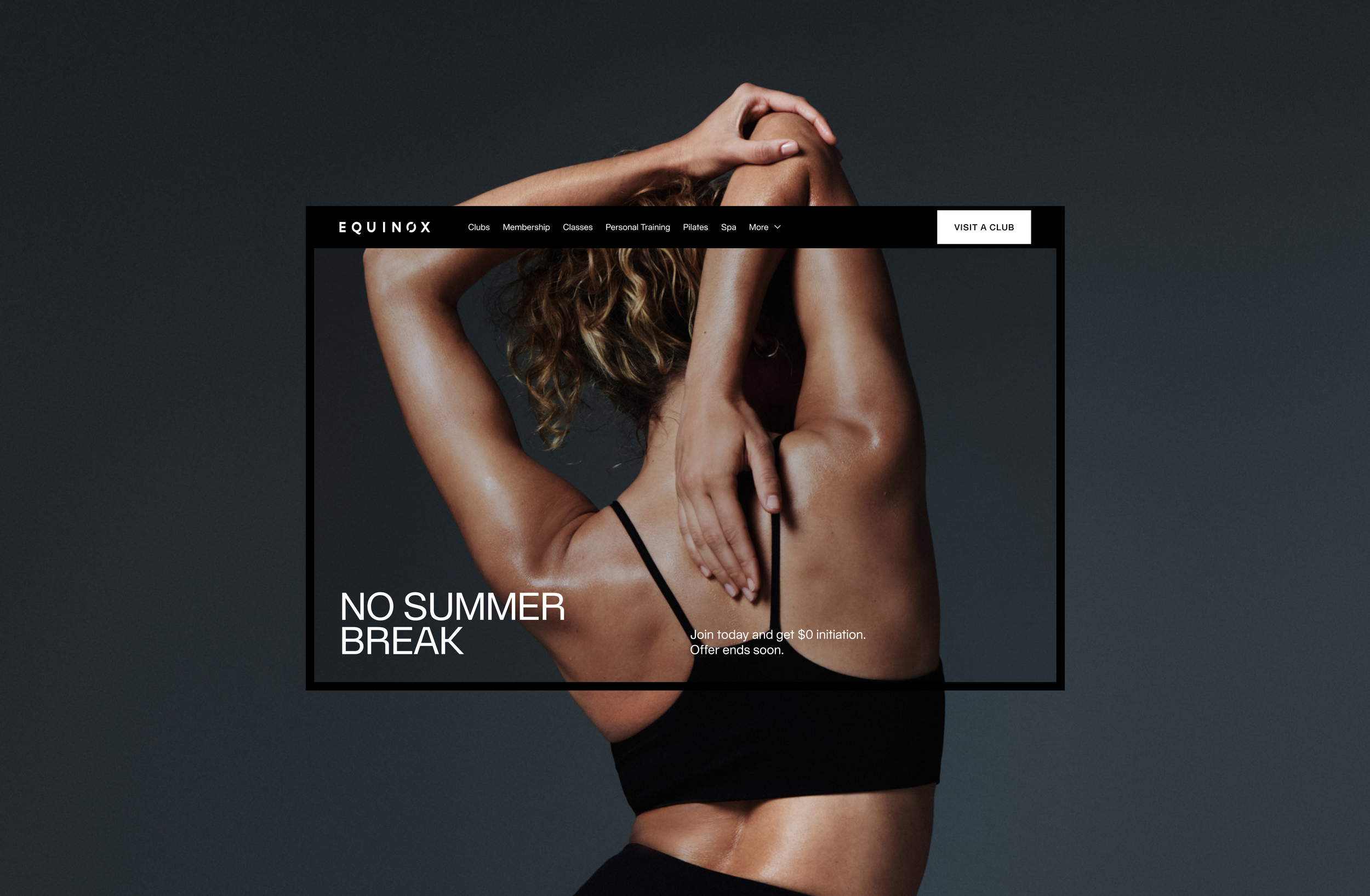
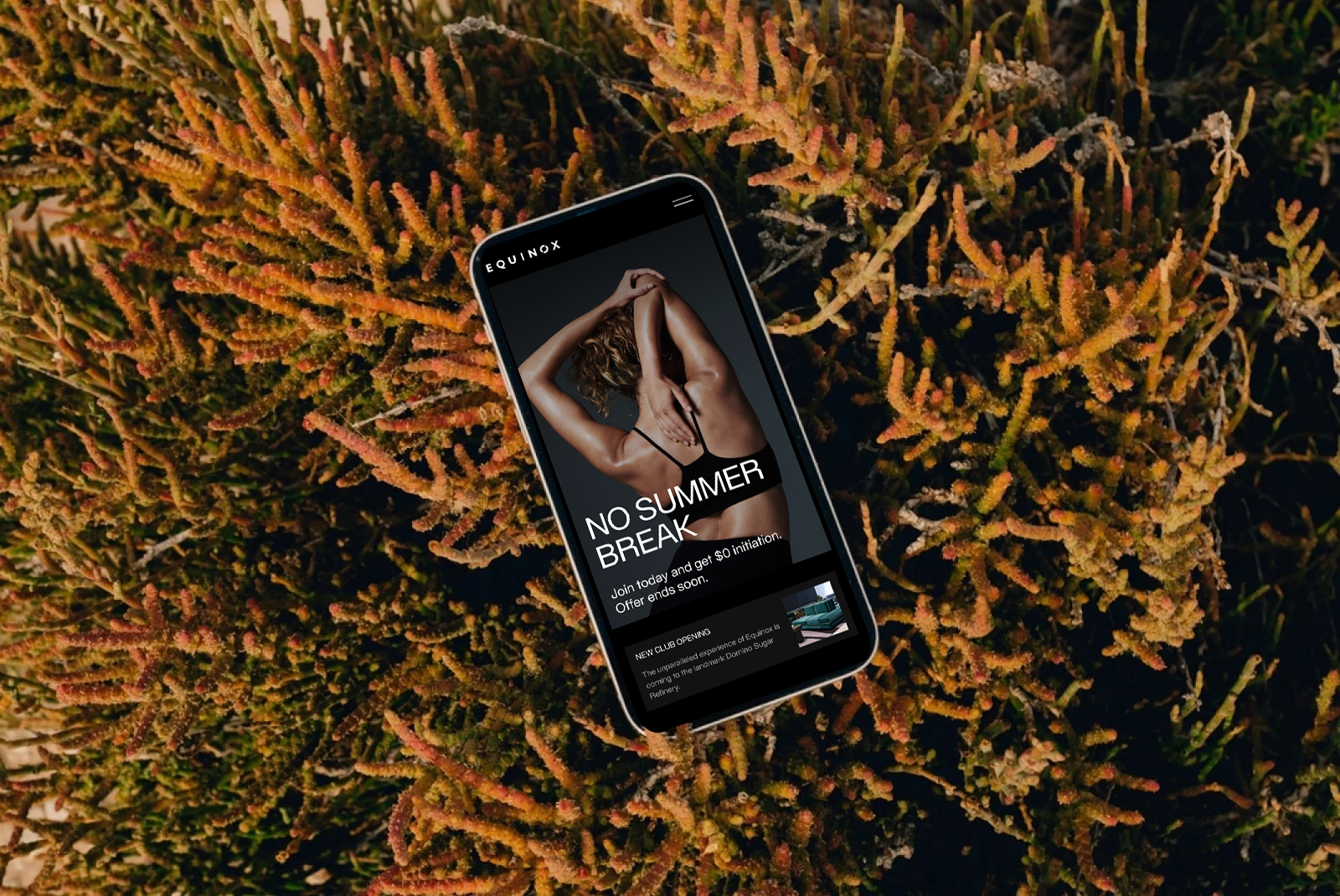
Homepage
The homepage was designed as a narrative entry point that introduces the Equinox brand while guiding users toward key actions such as exploring clubs, classes, and membership. The structure follows a storytelling flow, starting with emotional, brand-driven content and gradually transitioning into more functional sections like club discovery, membership value, and conversion. Visually, the layout uses large imagery, bold typography, and a strong grid to create a premium, editorial feel, while modular content blocks create rhythm and help users move through the page without feeling overwhelmed.
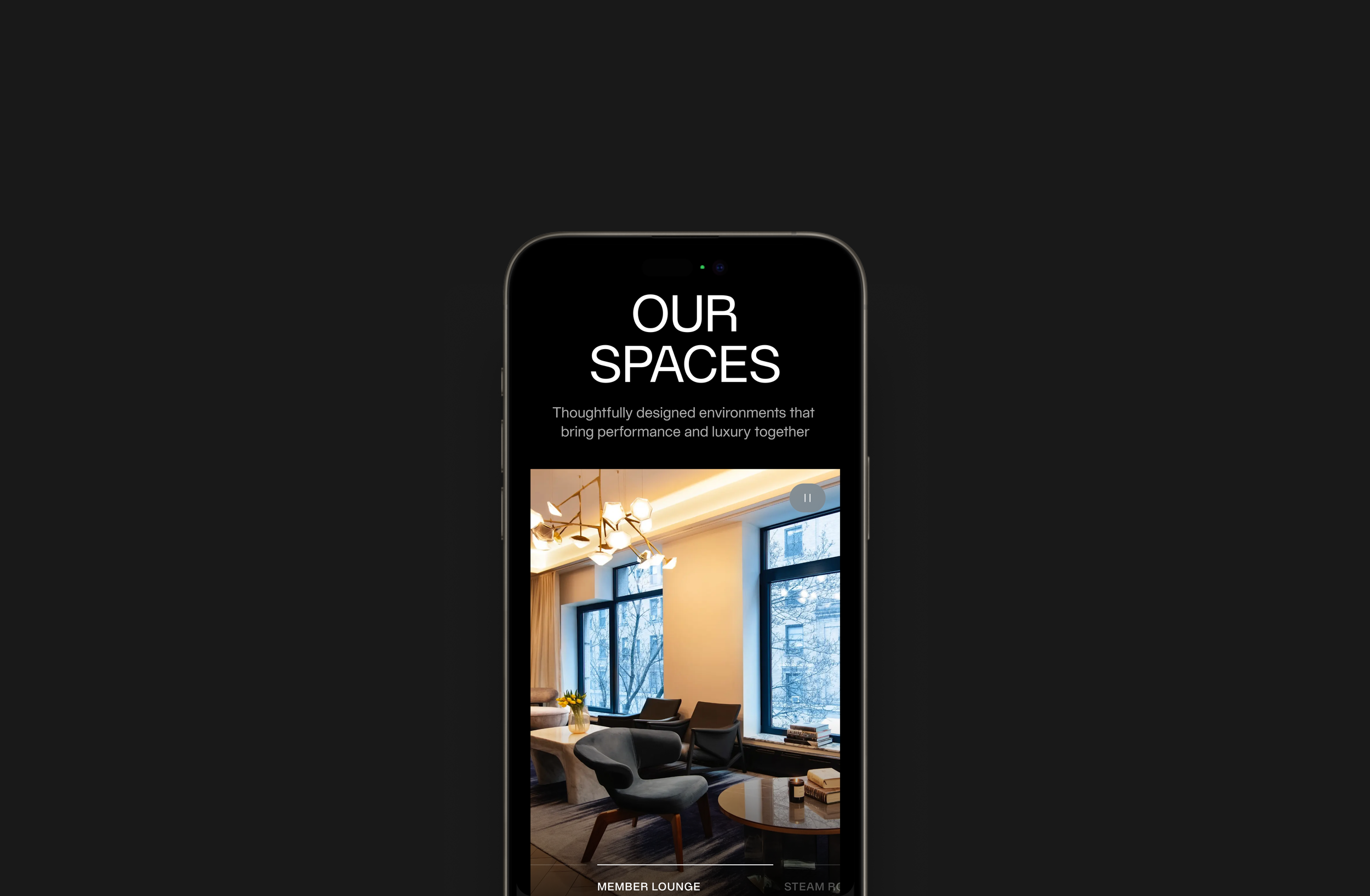
Member Benefits
The Member Benefits page was designed to clearly communicate the value of membership by organizing a wide range of offerings into structured, easy-to-scan sections. The flow moves from high-level benefits to more specific offerings such as classes, services, spaces, and recovery, helping users understand both the breadth and depth of the membership. Visually, the page balances large feature moments with structured content blocks, allowing the experience to feel both aspirational and informative while maintaining clarity and hierarchy.
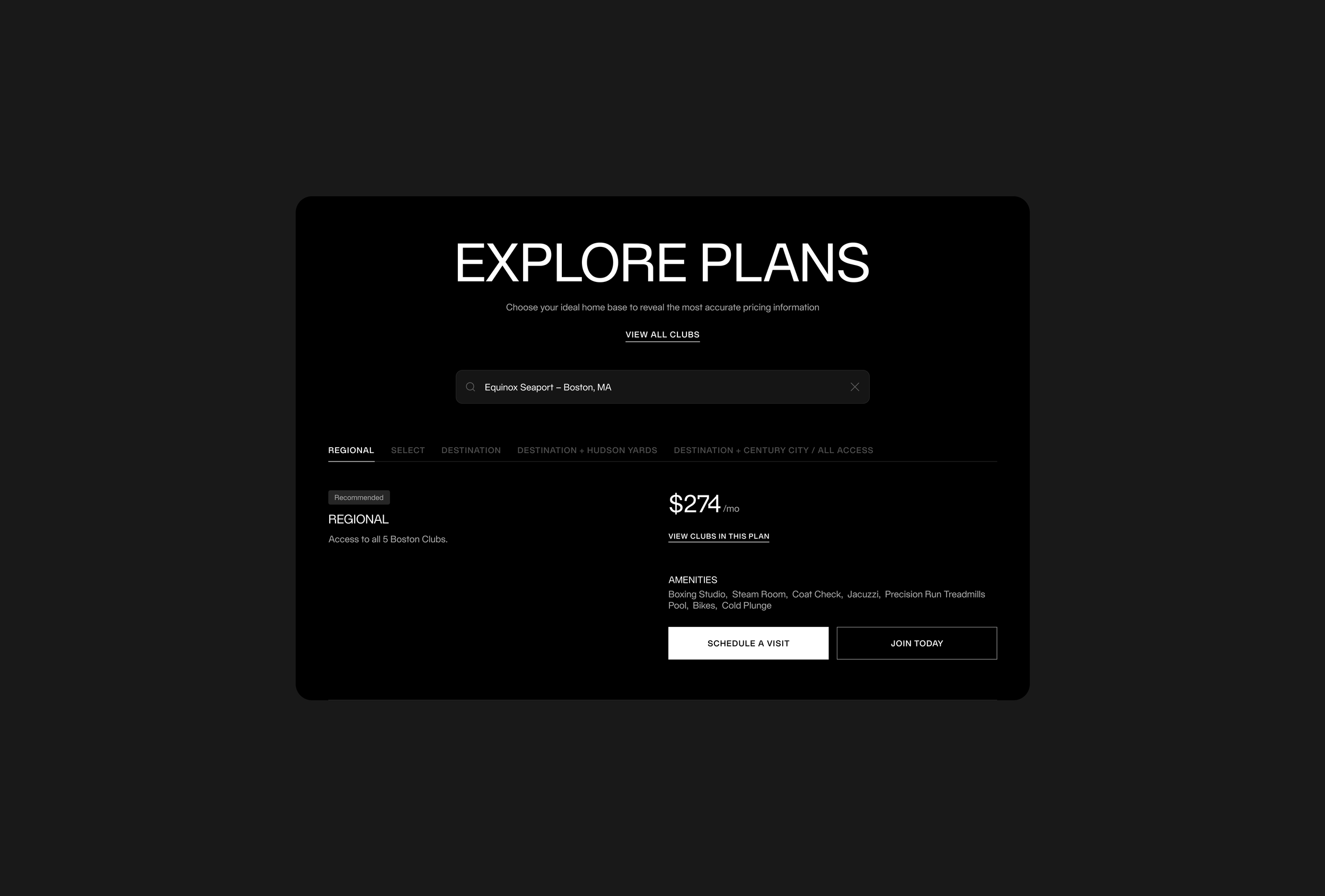
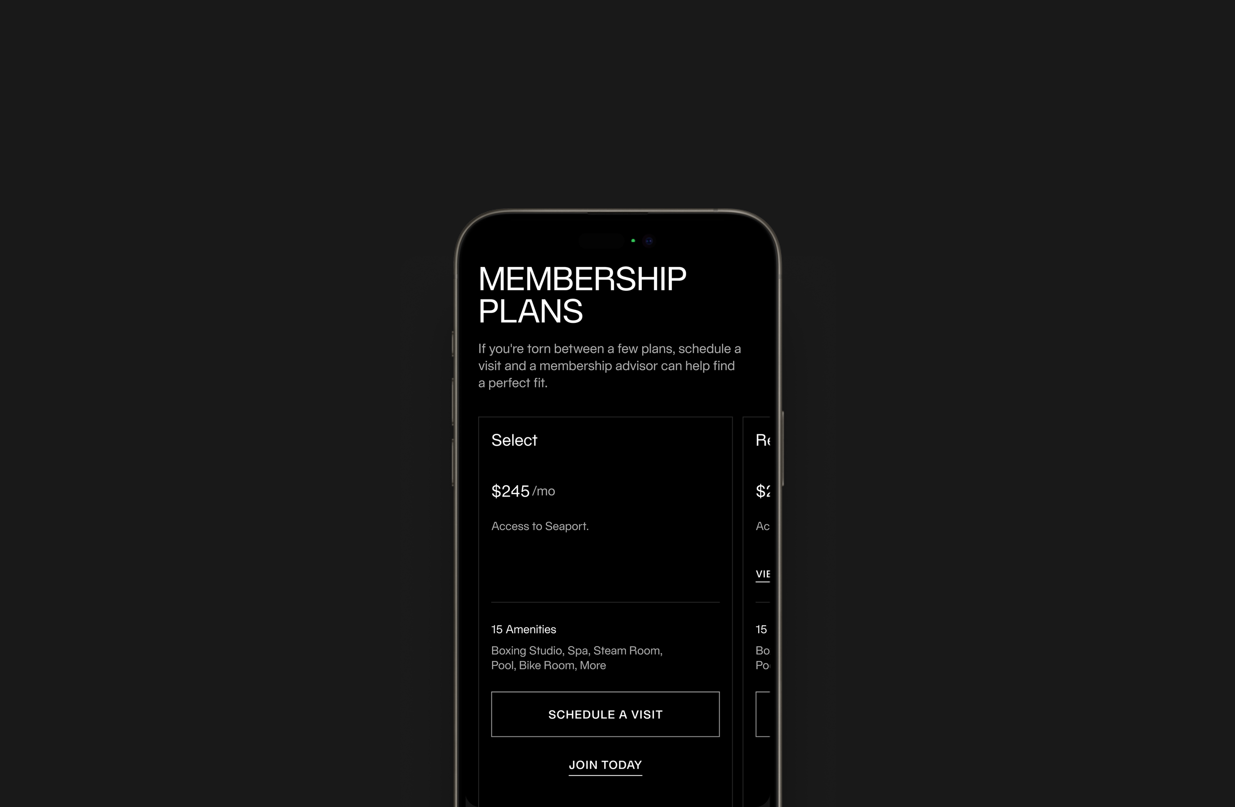
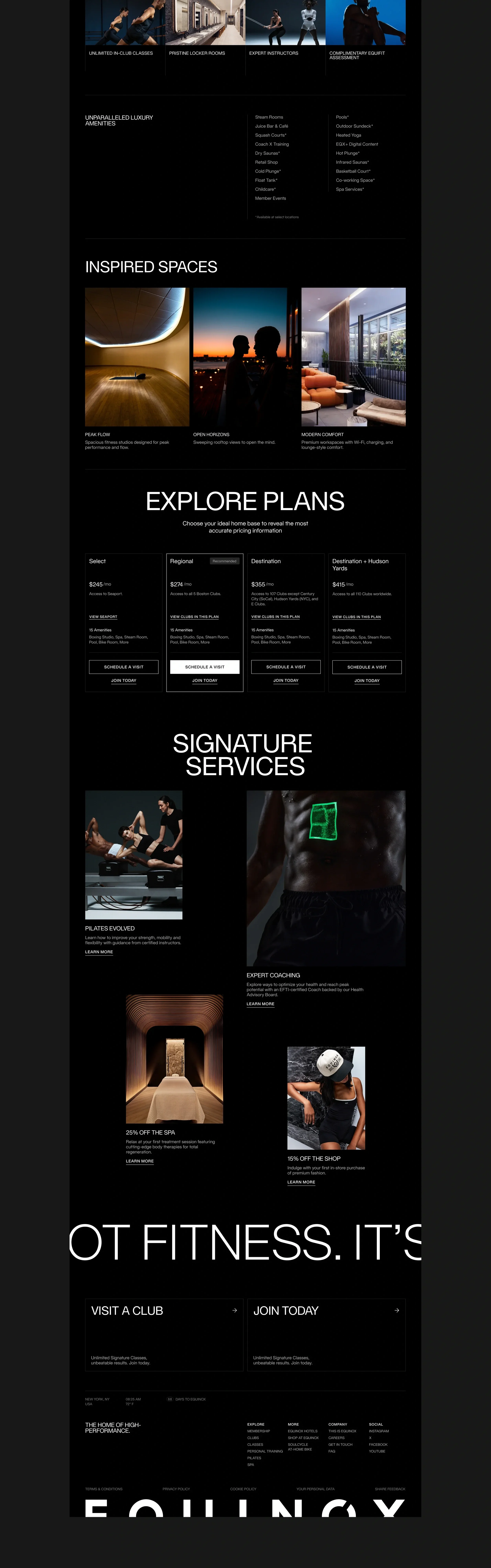
Membership Plan Selection
The membership plan selection experience was designed to simplify a complex decision into a clear, guided process. Users first select their primary club location, and plans are then presented based on that location, making pricing and access easier to understand and compare.
The layout emphasizes hierarchy, with pricing, access, and amenities structured for quick scanning. Clear actions like “Schedule a Visit” and “Join Today” are consistently placed to support conversion and create a straightforward path from exploration to membership sign-up.