Equifit Experience
Year
2025
Role
Lead Visual Designer
Platform
iOS, Mobile app
Focus
Data visualization, Guided assessment flow, Results & feedback
Team
Product, Engineering, Data teams
Equifit reimagines how personalized fitness programs are created, delivered, and understood—transforming fragmented workout data into a connected system that helps users train with intention and clearly track their progress over time. The experience bridges assessment, training, and results into a single, cohesive journey.
My Role was;
As Lead Visual Designer, I defined the visual language, interaction principles, and system consistency across the entire product. I worked cross-functionally with product, engineering, and coaching teams to translate complex fitness data into clear, scalable, and engaging user experiences, while ensuring alignment with Equinox’s premium brand.
Challenge
The core challenge was making complex biometric and performance data understandable and actionable without overwhelming the user. The experience needed to support multiple moments—from onboarding and planning to in-session guidance and post-workout reflection—while maintaining clarity, continuity, and motivation throughout.
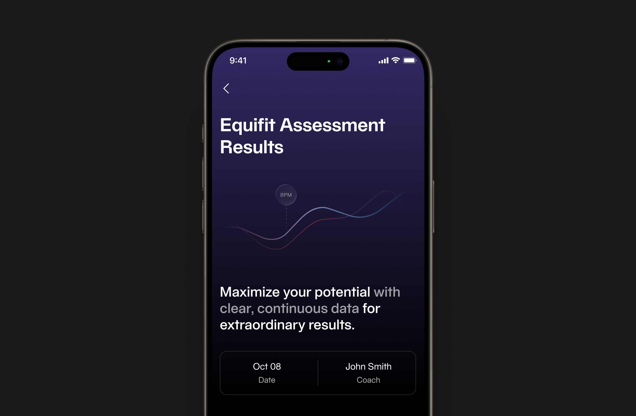
Assessment Overview
I led the visual direction for how assessment results are introduced, focusing on clarity and motivation from the first screen. The experience frames complex fitness data as an opportunity—using strong hierarchy, restrained motion, and concise messaging to position results as actionable insights rather than static numbers. This sets the tone for a system where data becomes a starting point for progress.
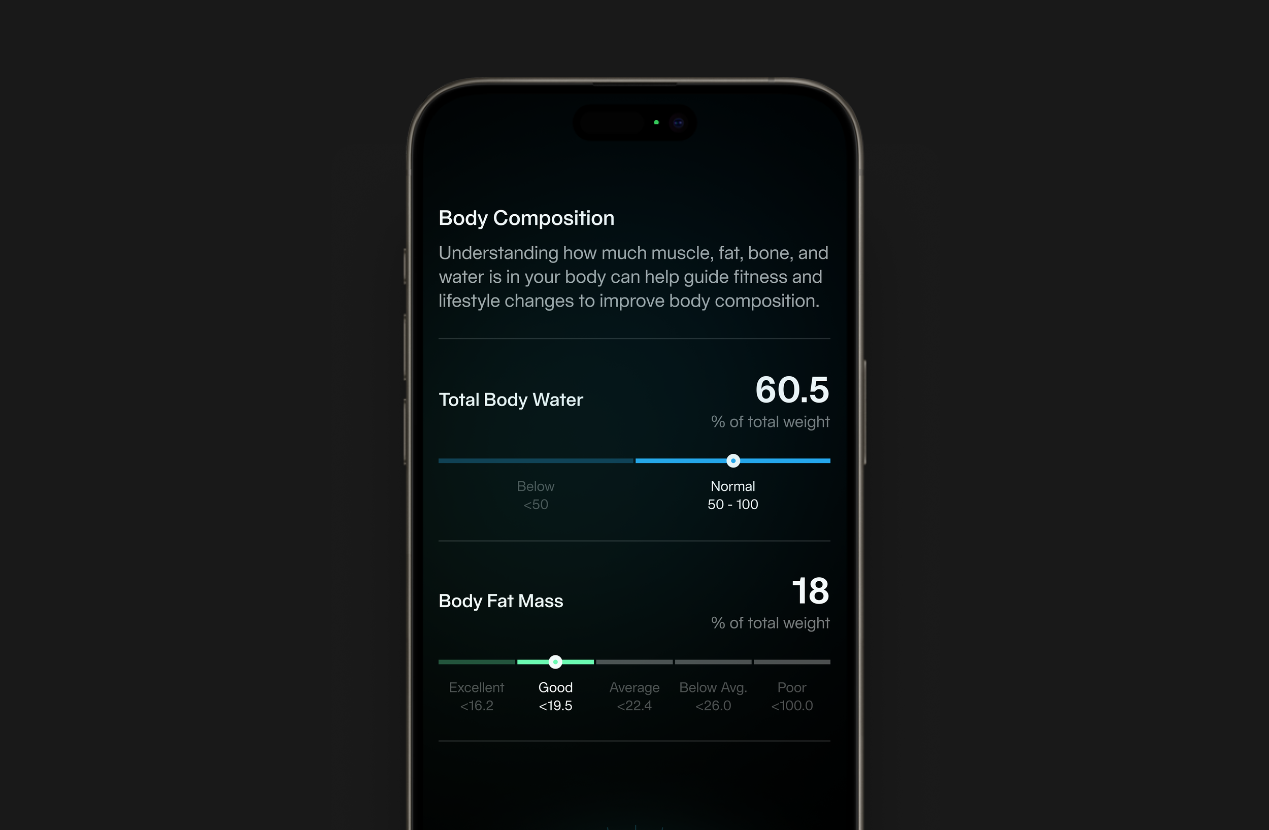
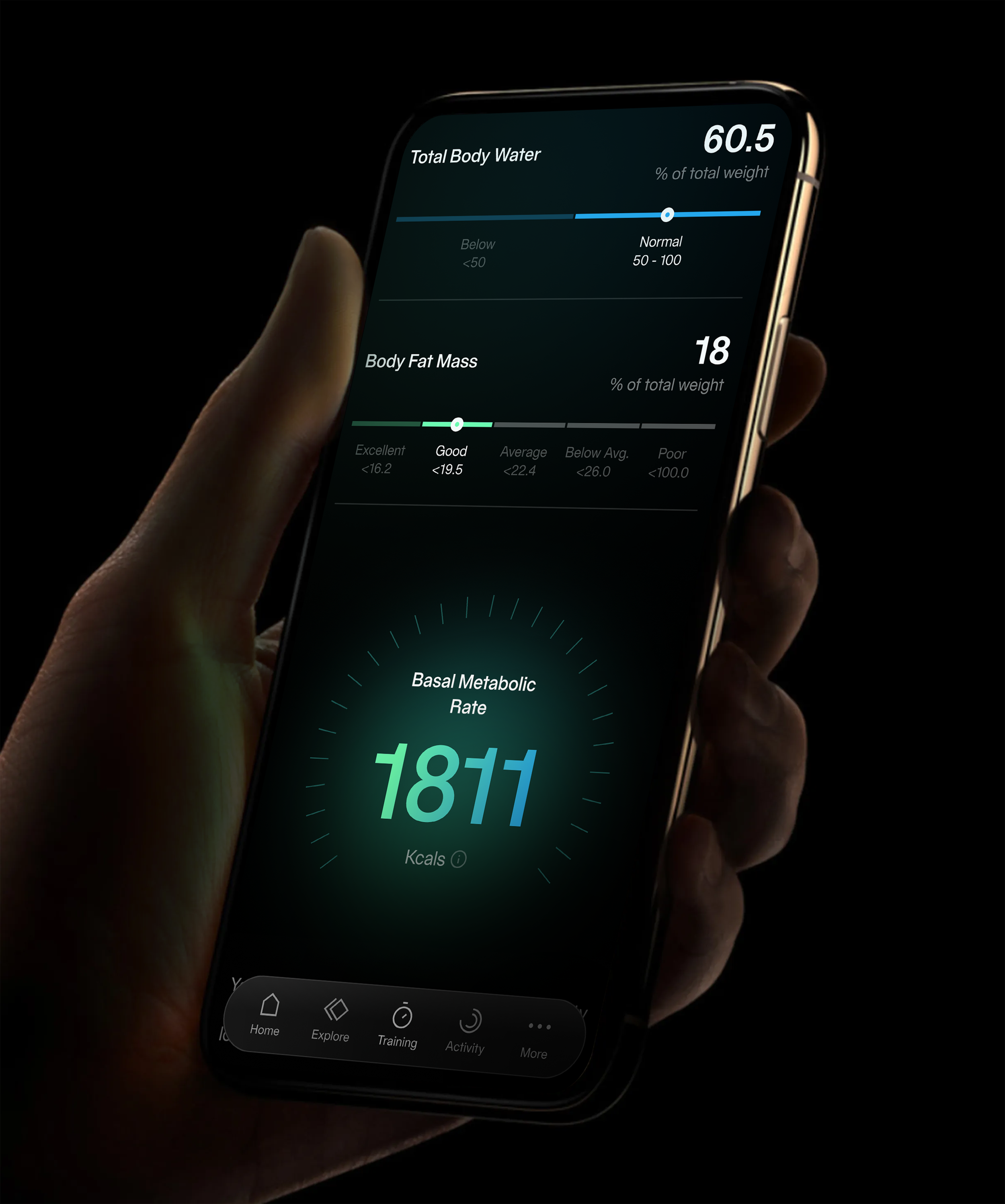
Translating Metrics into Meaning
I designed a flexible visualization system that transforms raw biometric data into intuitive, easy-to-read signals. Metrics like body water, body fat, and metabolic rate are expressed through progressive scales, color gradients, and focused numeric emphasis. Each element is designed to be quickly understood at a glance, allowing users to interpret their current state without needing technical context.
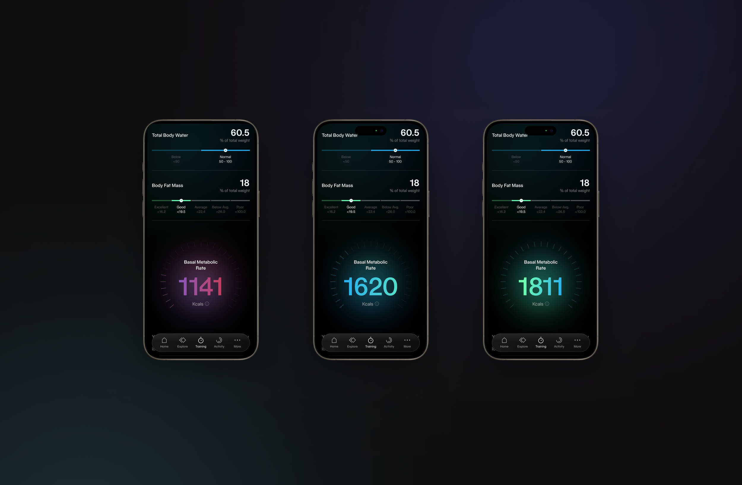
Personalized Data Expression
To reinforce individuality in results, I introduced a dynamic visual treatment where key metrics adapt through color and intensity. This creates a sense of progression and variation across users, making the experience feel less static and more reflective of personal performance. The system balances consistency with subtle differentiation, maintaining clarity while enhancing engagement.
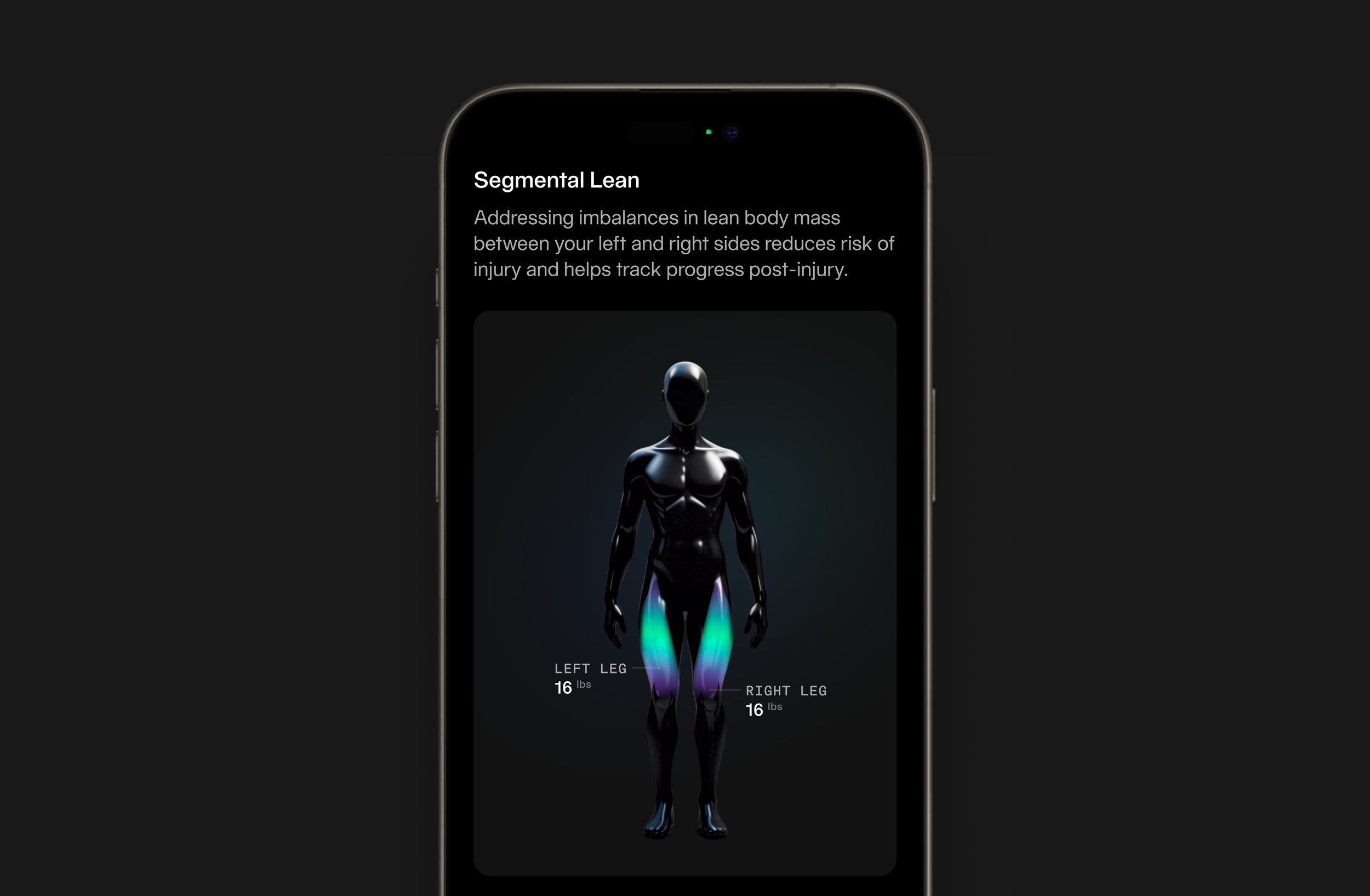
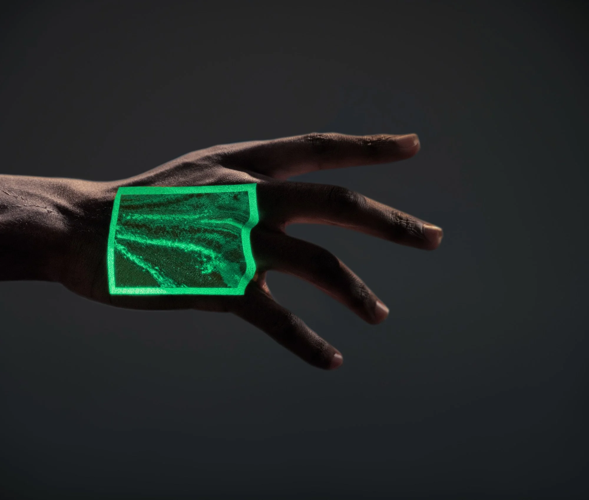
Segmental Balance Visualization
A minimal, high-contrast body form becomes the canvas for data, where light and color subtly reveal imbalance and distribution. This approach replaces numerical complexity with an immediate, spatial understanding of the body.
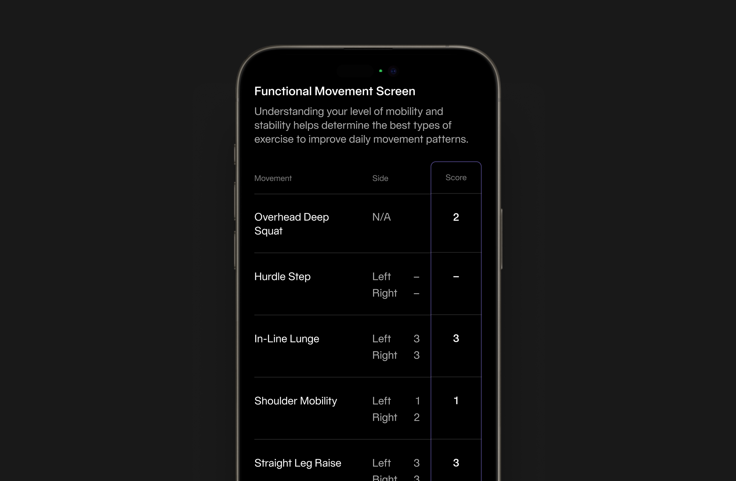
Movement Assessment Structure
A strict typographic grid and restrained layout organize functional data into a clear, scannable system. Emphasis is placed on alignment, spacing, and contrast to ensure performance metrics are quickly interpreted without visual noise.
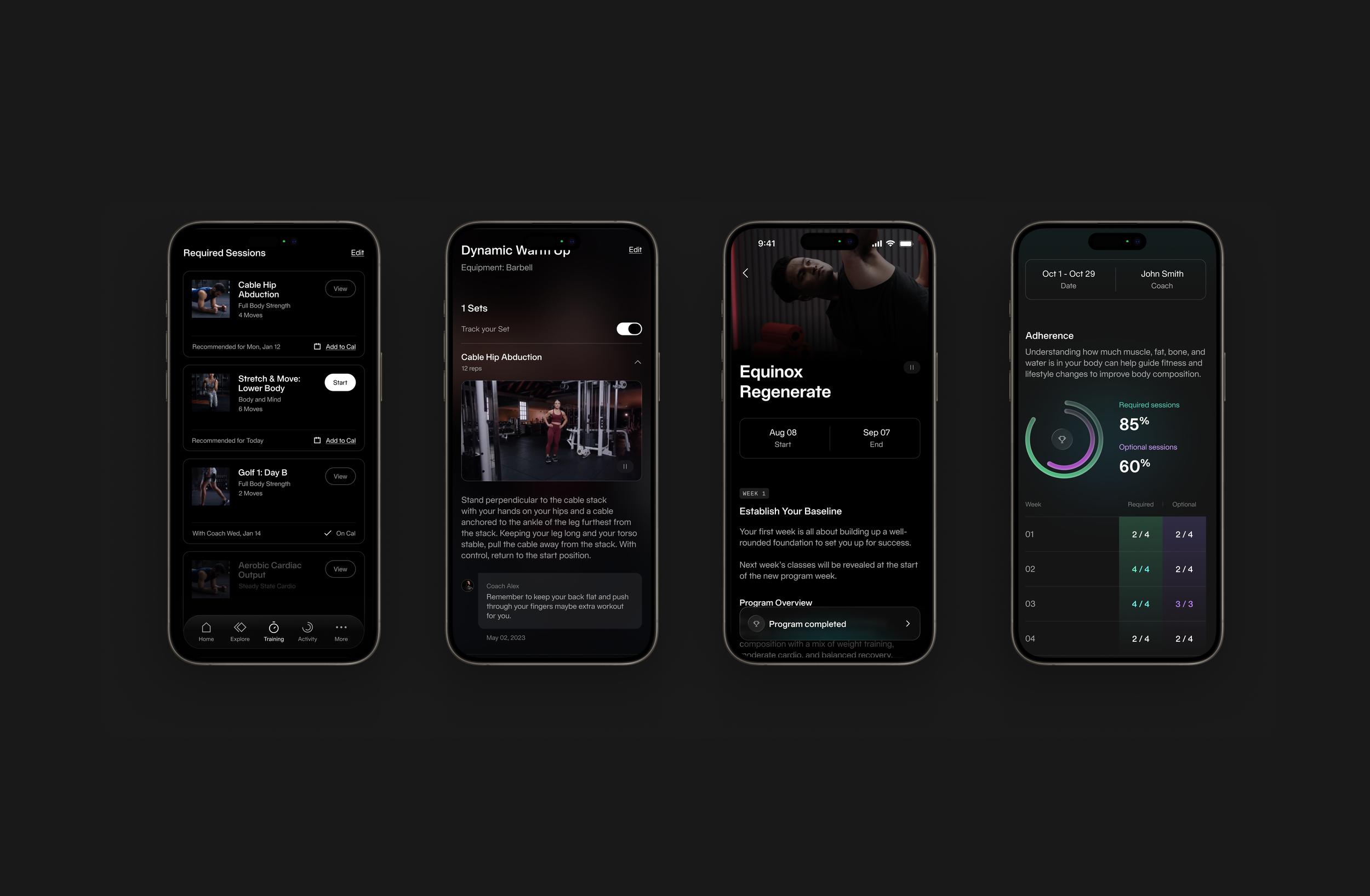
From Insight to Personalized Training
Equifit results serve as the foundation for a fully personalized training experience, translating assessment data into structured programs tailored to each user. I designed this flow to seamlessly connect insight with action—where recommended sessions, guided workouts, and program milestones are all informed by the user’s unique profile.
The interface balances clarity and progression, using consistent layouts, visual hierarchy, and subtle motion to guide users from daily workouts to long-term goals. Coaching content, tracking, and adherence are integrated into a unified system, ensuring users not only follow a plan, but understand how it evolves based on their performance.
By aligning data, guidance, and feedback into a single experience, the design creates a continuous loop—where results inform the program, and the program continuously drives new results.
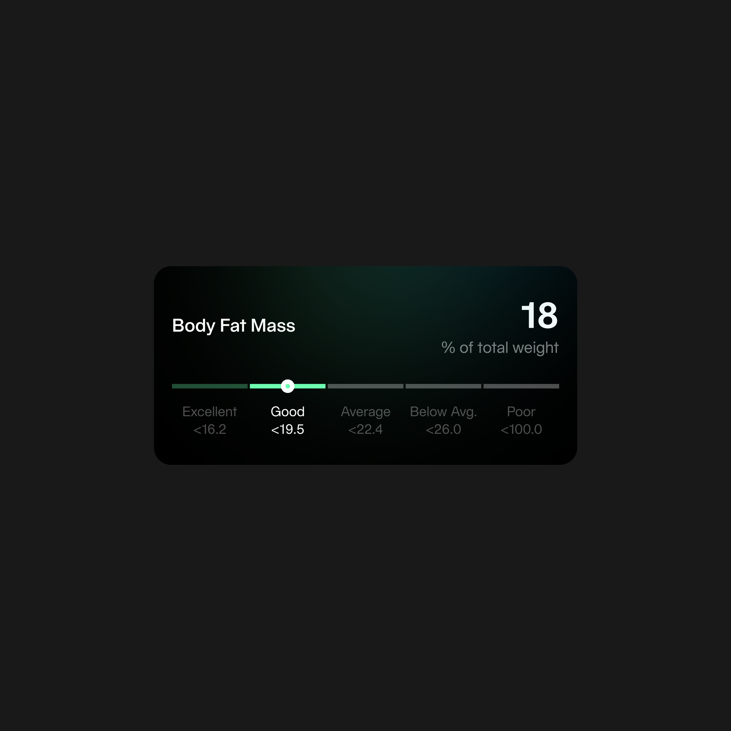
A compressed visual scale paired with subtle color transitions reduces complex body composition data into a single, legible signal.
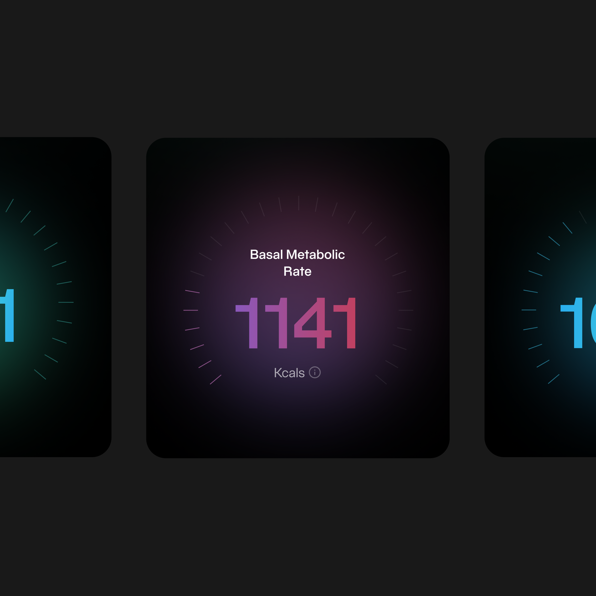
A centralized numeric expression anchors the screen, using scale, glow, and contrast to elevate the metric as the primary focal point.
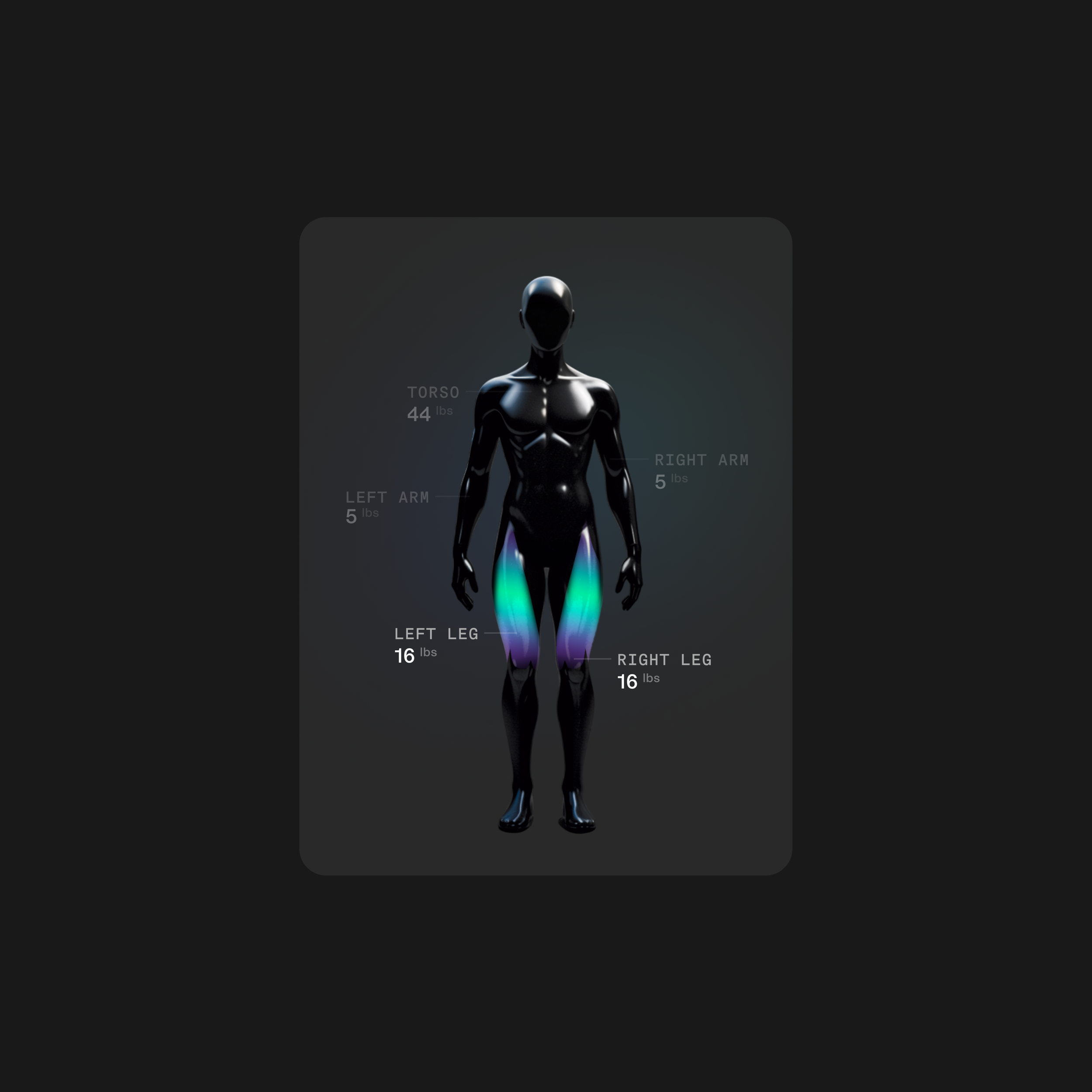
Data is spatially mapped onto the body, using light and color to create a direct visual connection between metrics and physical form.
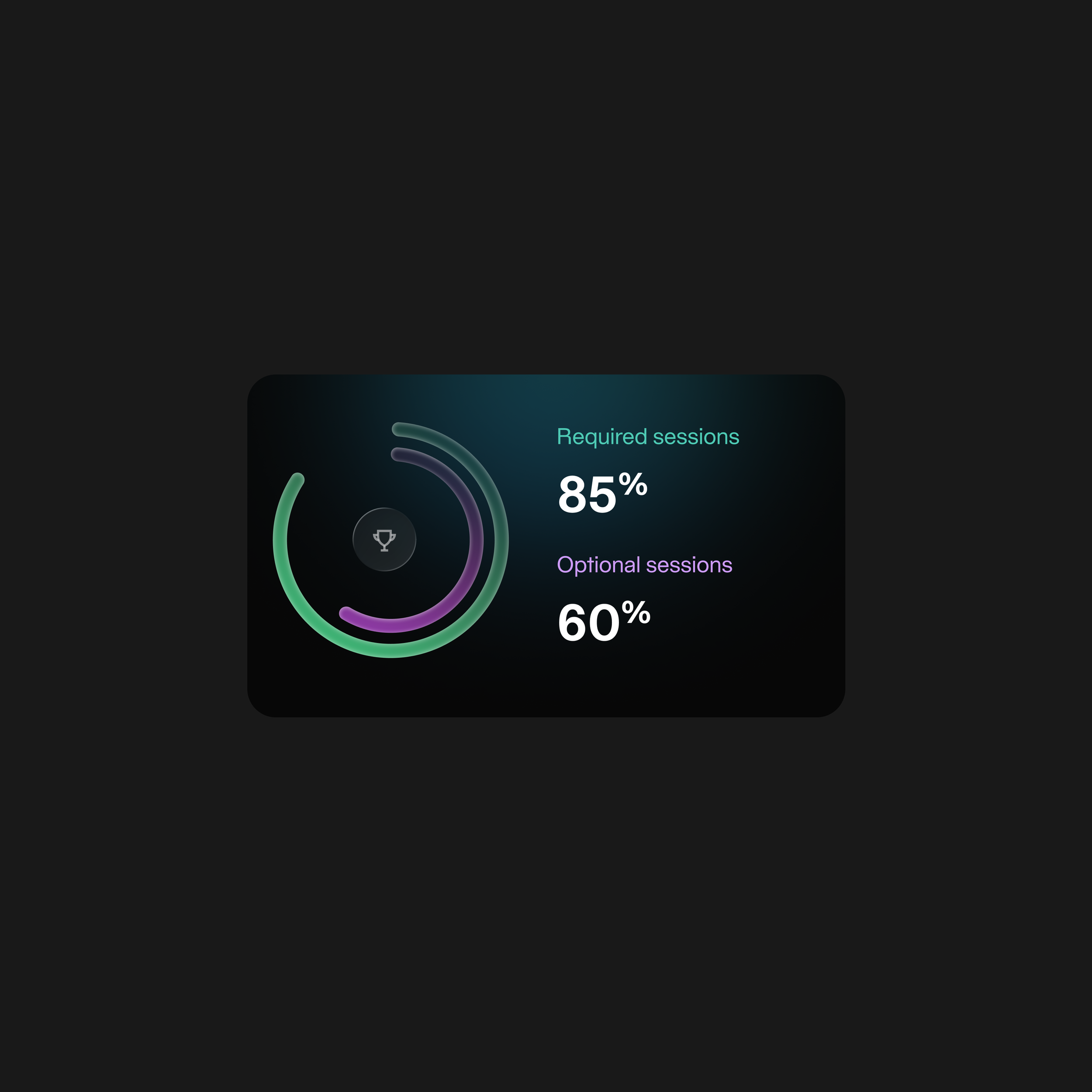
Circular composition and gradient accents translate adherence into a clear visual rhythm, enabling quick interpretation at a glance.