EQX Training™
Year
2025
Role
Lead Visual Designer
Platform
In-club devices, iOS
Focus
Real-time UI, Performance data, Guided workouts, Physical–digital experience
Team
Product, Engineering, Data teams
The Training experience was designed to help members discover, book, and manage personal training sessions in a seamless and premium way—bridging content, scheduling, and purchase into a unified flow.
As Lead Visual Designer, I shaped the visual direction and system consistency across the entire journey—from exploration to checkout.
Approach & Constrains
The redesign focused on simplifying decision-making, creating a clearer sense of progression, and establishing consistent UI patterns across discovery, scheduling, and purchase. The goal was to create a more cohesive training experience that felt structured, intuitive, and aligned with the Equinox premium brand while supporting scalability across the platform.
The solution needed to work within existing technical systems, membership logic, and scheduling infrastructure while supporting multiple services, pricing structures, and user types. The design also had to remain consistent with the Equinox design system and premium brand standards, requiring flexible and scalable UI patterns that could support future features and services.
Project Goal & my Role
The goal was to design an end-to-end training experience that simplifies decision-making and booking, clearly communicates value and pricing, and maintains a premium, guided feel from discovery through purchase and confirmation.
As Lead Visual Designer, I defined the visual system and interaction patterns across the entire flow and led the design direction for training discovery, scheduling, and checkout. I worked closely with Product and Engineering to shape the flow structure within technical constraints and helped establish scalable UI patterns, component behavior, and hierarchy across the experience. My role focused on ensuring the experience felt cohesive, intuitive, and consistent while supporting system-level scalability across the platform.
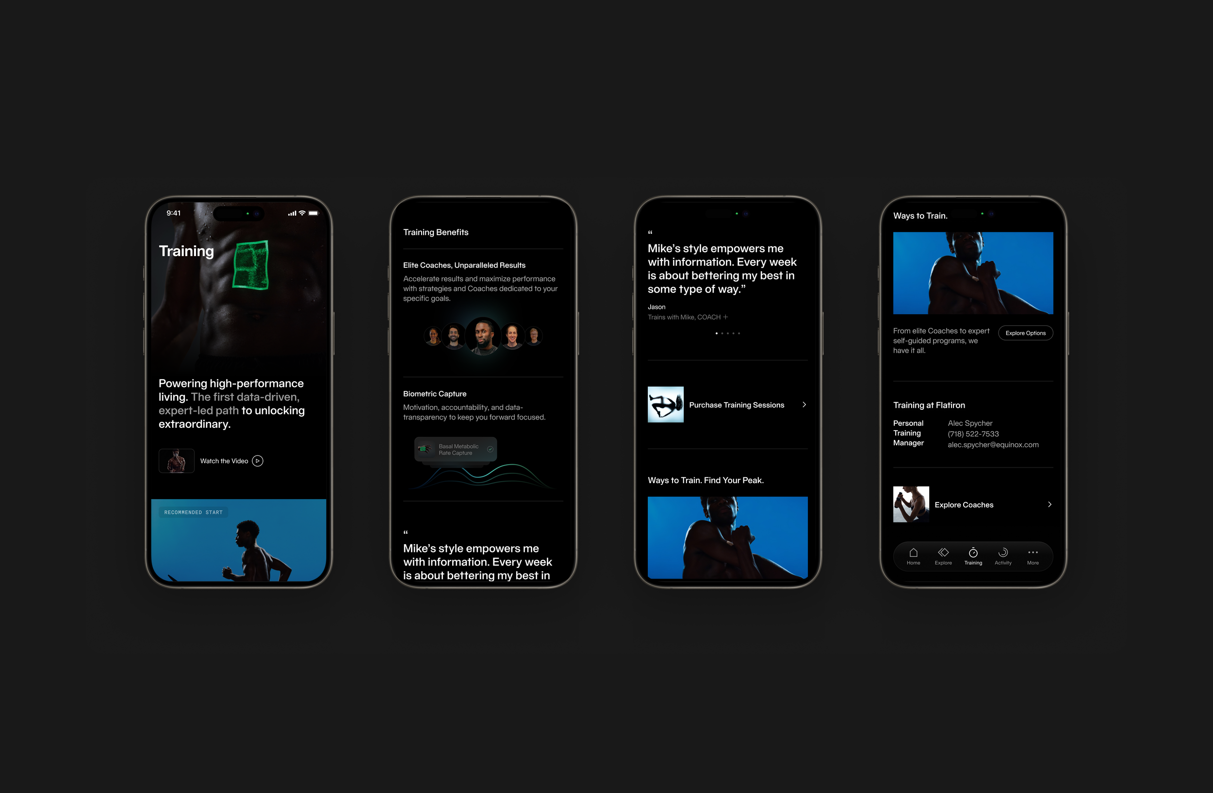
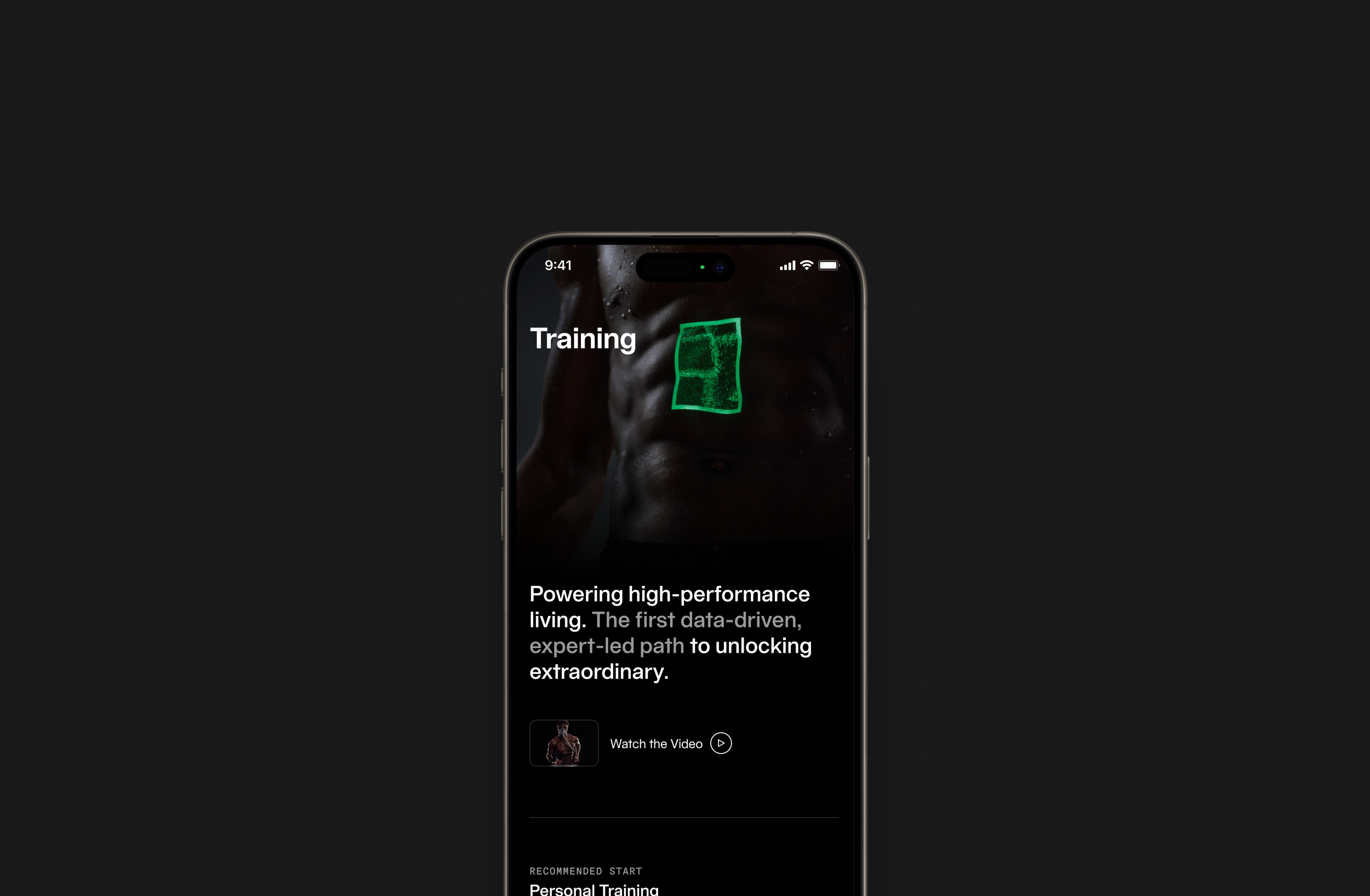
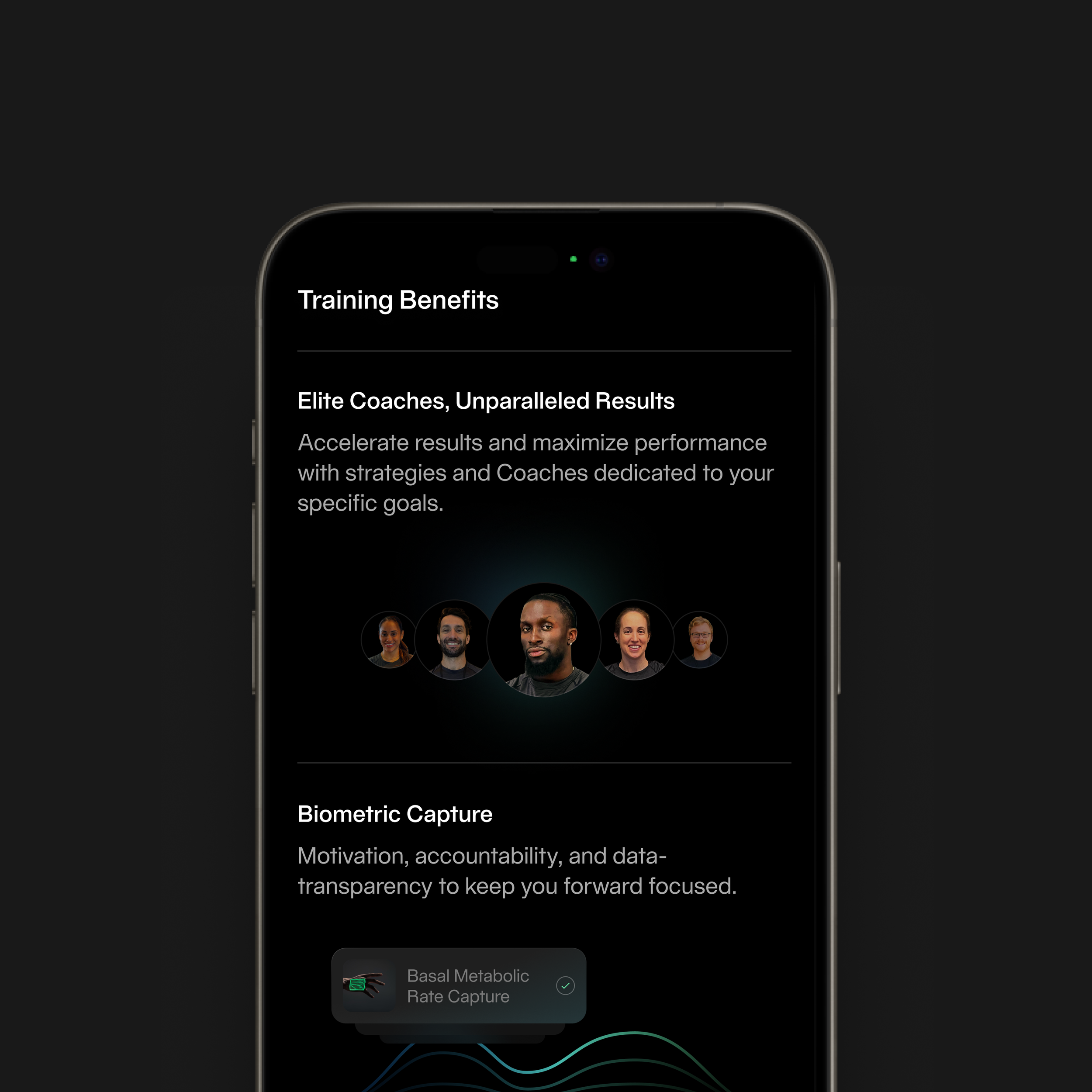
Training Benefits
Training is a premium service, so the experience needed to communicate both what members can do and why it matters. This section explains the value of coaching, biometric tracking, and personalized programming, helping members understand that training is not just a session they book, but a structured program designed around their goals.
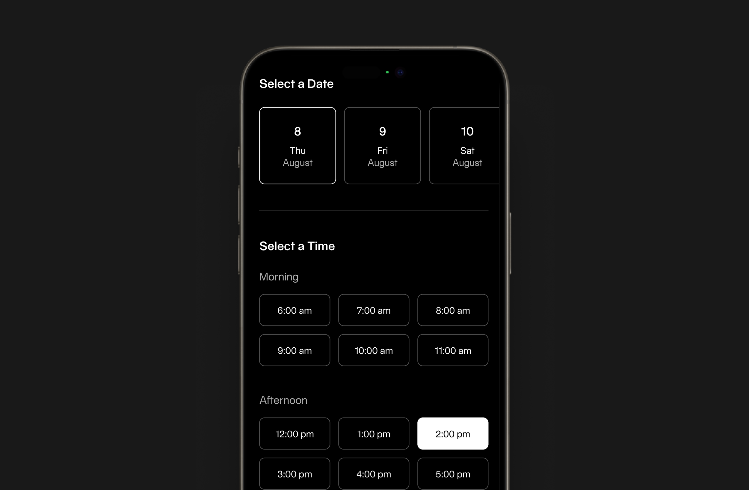
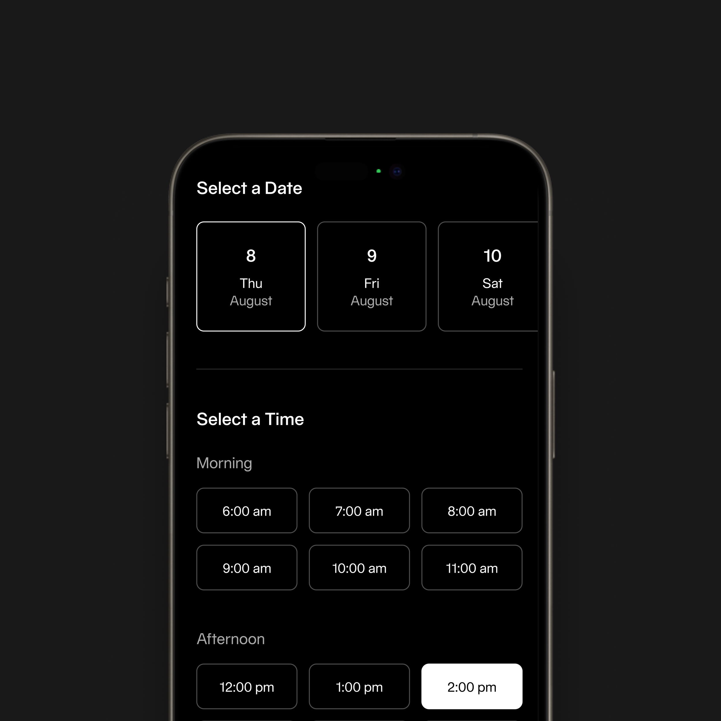
Scheduling
Scheduling is structured in two steps: selecting a date, then selecting an available time. Time slots are grouped by morning and afternoon to make scanning easier and reduce cognitive load. The goal was to make booking a session fast, clear, and repeatable
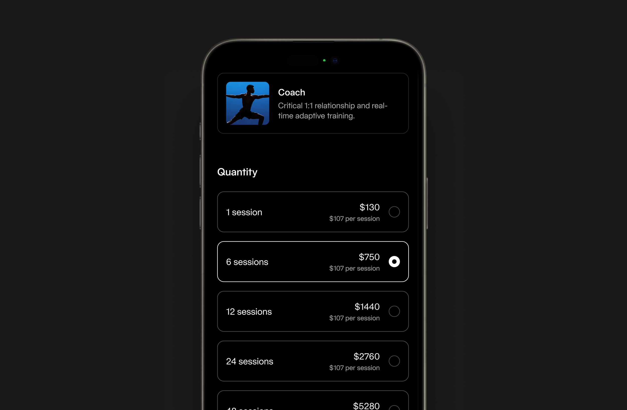
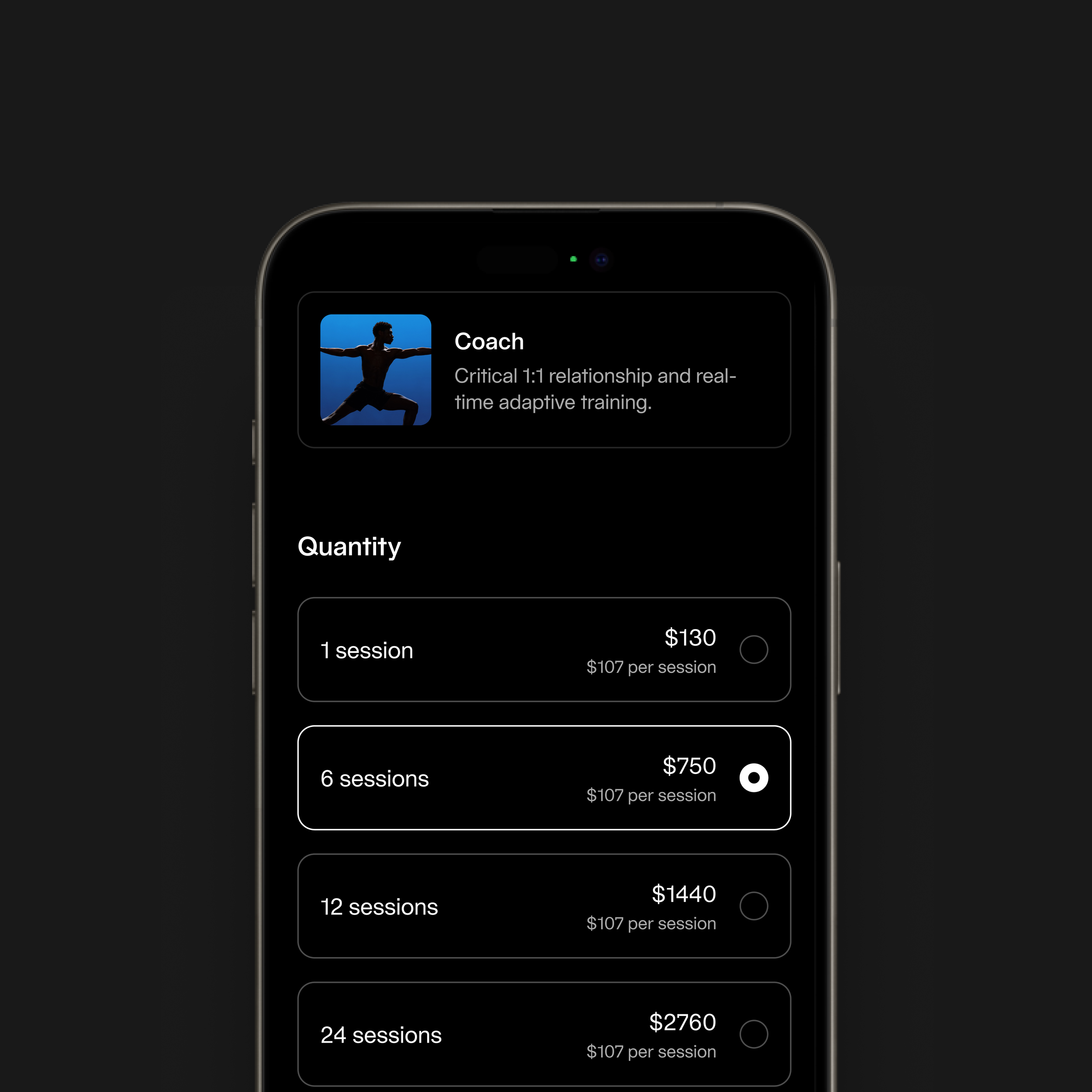
Purchasing Sessions
The purchase flow was redesigned to feel clear and easy to compare. Session packages are presented in a structured way that highlights price per session and total cost, helping members choose the option that works best for them. The goal was to make purchasing feel like continuing a program rather than making a one-time transaction.
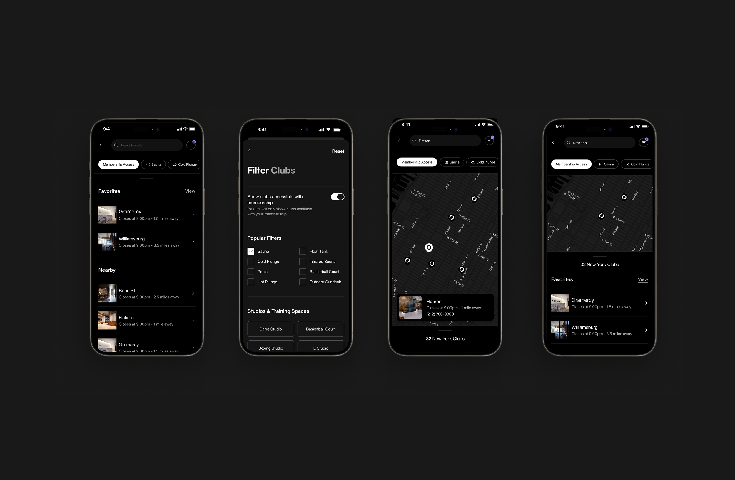
Select a Clubs
The clubs experience helps members quickly find where they can train. The map allows members to browse nearby locations, while filters help narrow results based on amenities and membership access. Favorites and nearby clubs are surfaced to make selection faster and more convenient.
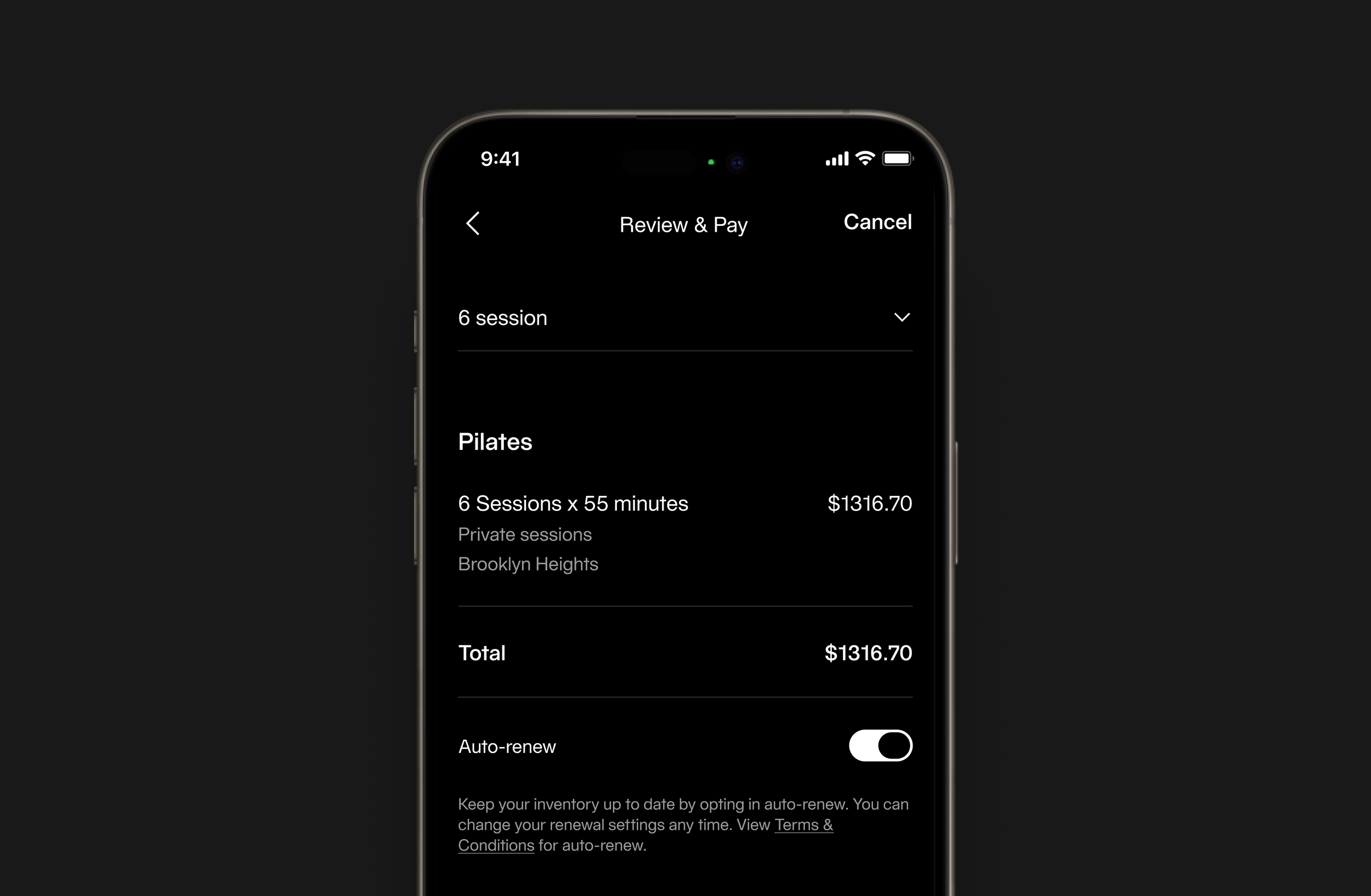
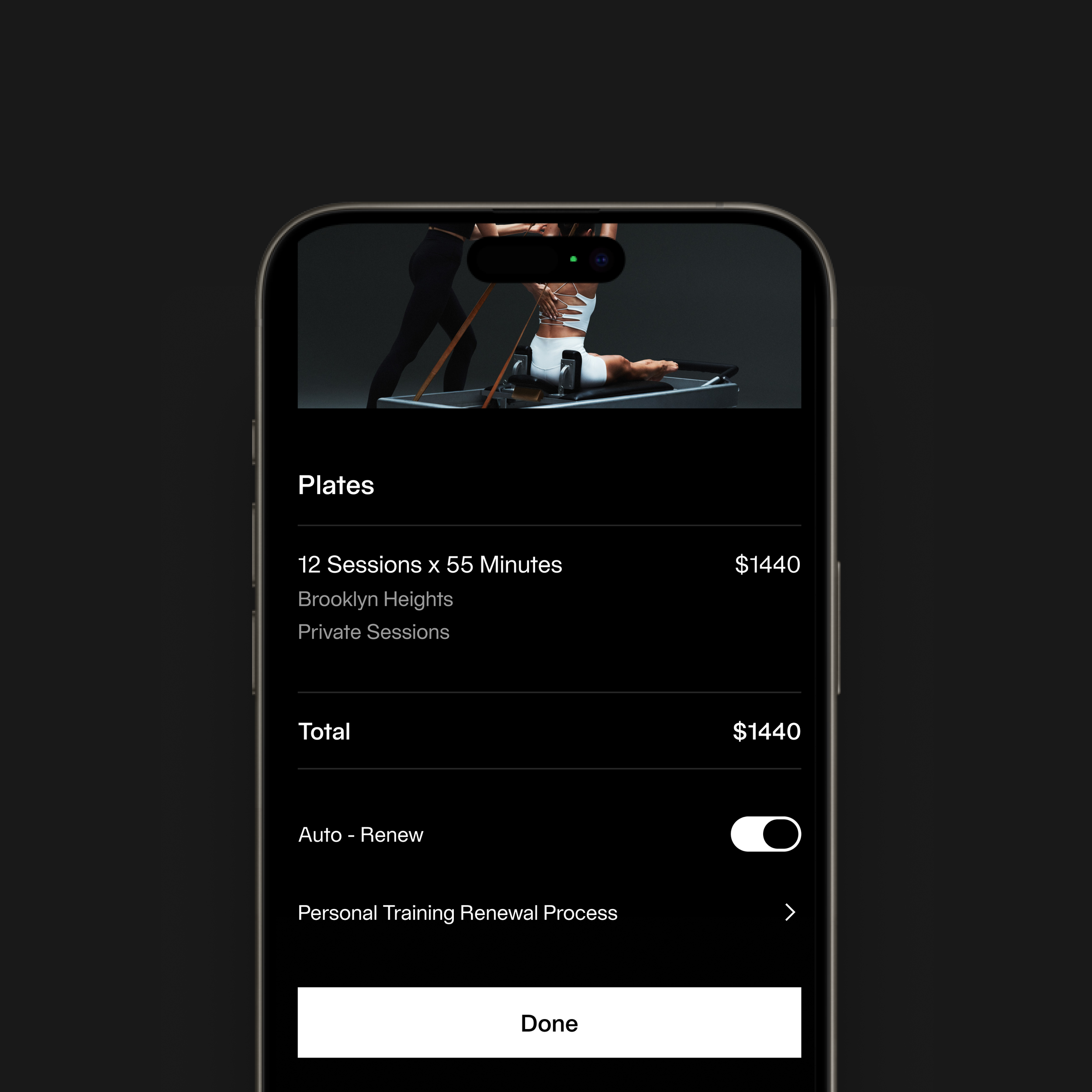
Review & Pay
The review screen summarizes the selected package, session type, location, and total price so members can clearly understand what they are purchasing. The layout is designed to reduce uncertainty and make the final step feel clear and controlled.
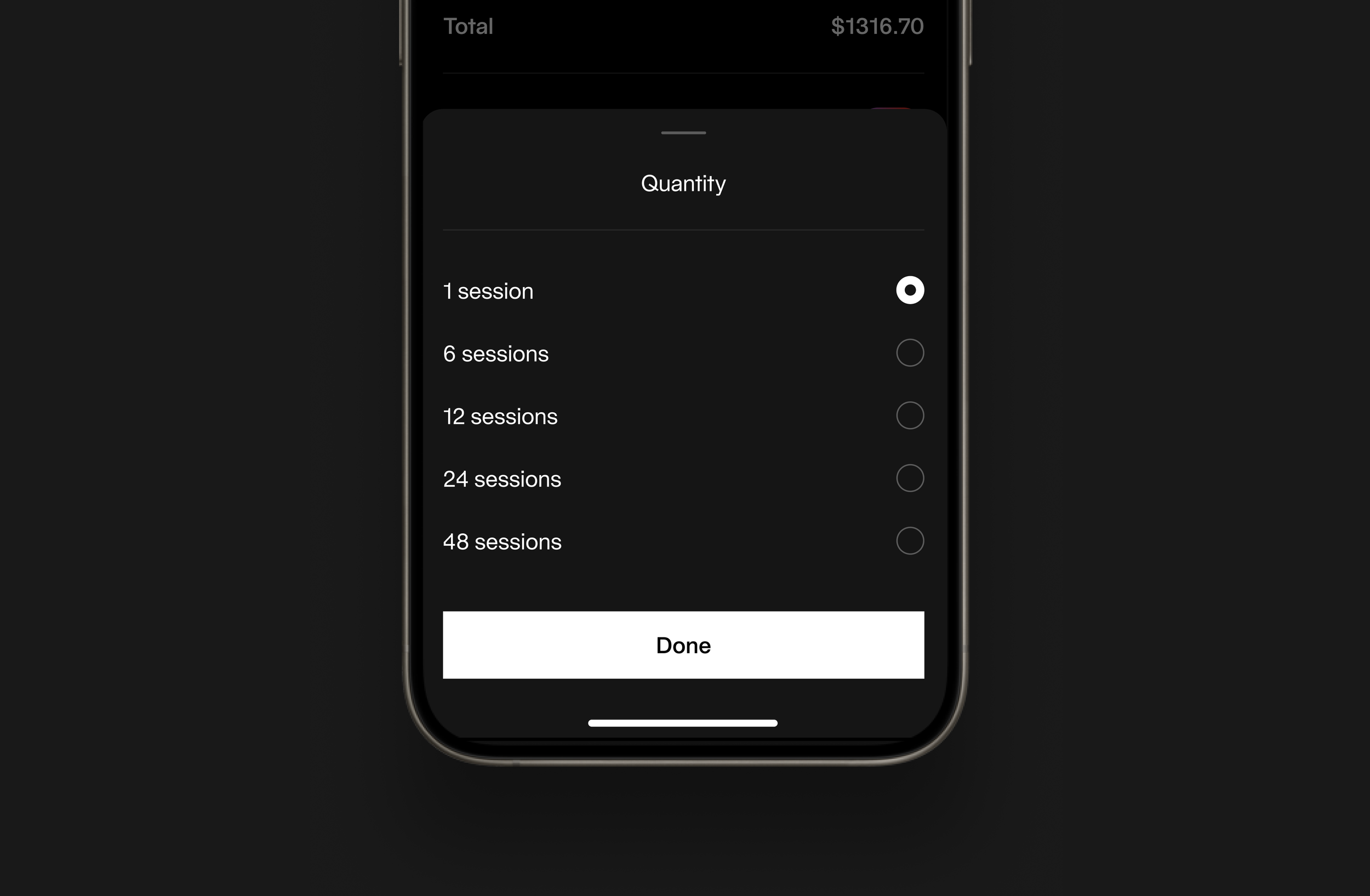
Session Selection
Package selection appears as a bottom sheet to keep users within the purchase flow while making a decision. This reduces navigation friction and allows users to quickly compare session packages in context. The interaction is designed to be fast and lightweight, supporting repeat purchases and minimizing interruption to the booking process.
System-Driven UI
We approached the experience through a system-driven UI, leveraging reusable components and consistent layout patterns across the training overview, scheduling interface, and purchase and checkout flows. By establishing a unified set of components, we ensured that each step of the journey felt familiar and predictable, reducing cognitive load as users moved between discovery, selection, and transaction. This consistency not only improved usability but also created a cohesive visual rhythm throughout the product, while enabling scalability and more efficient collaboration with engineering.
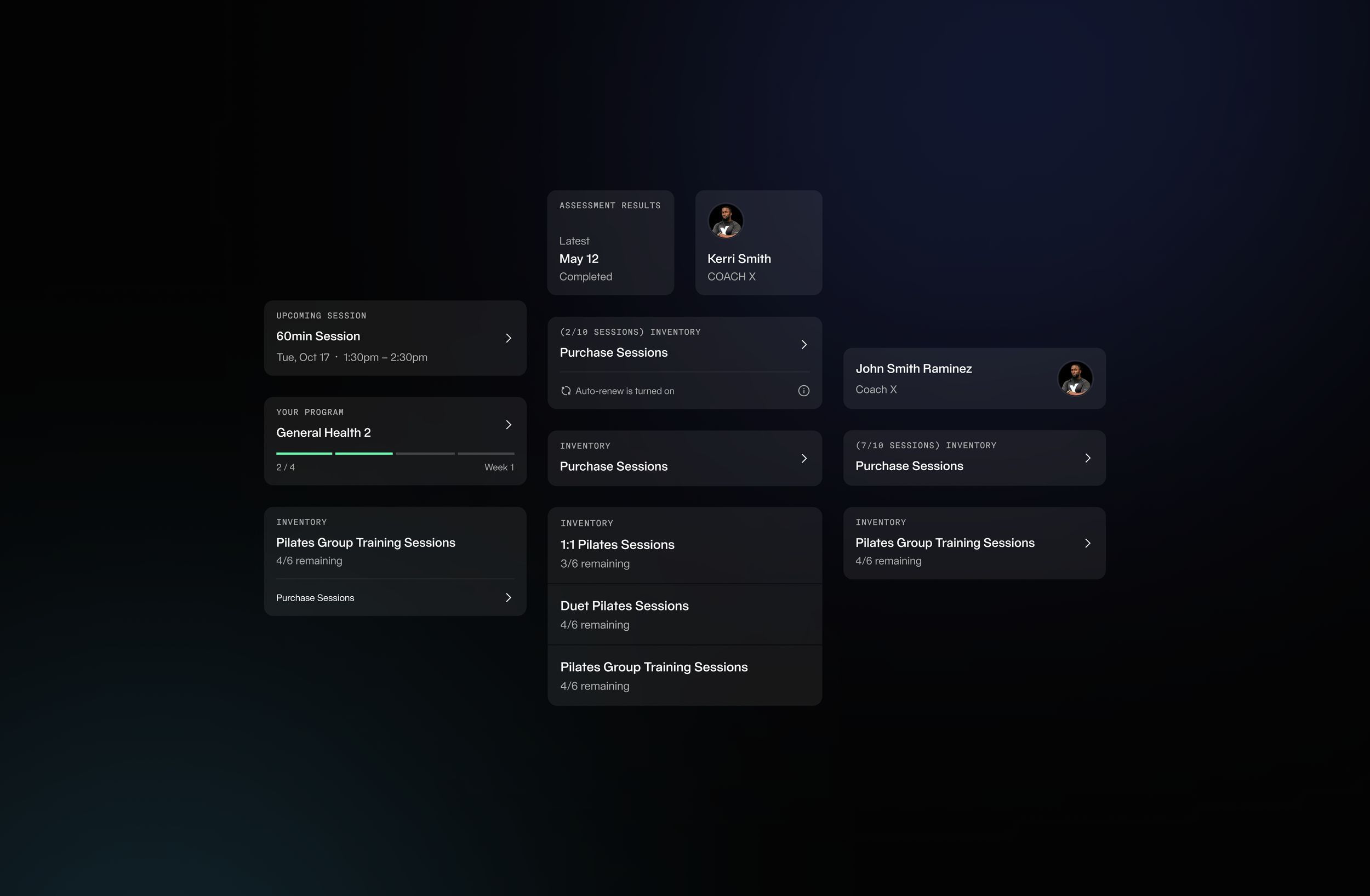
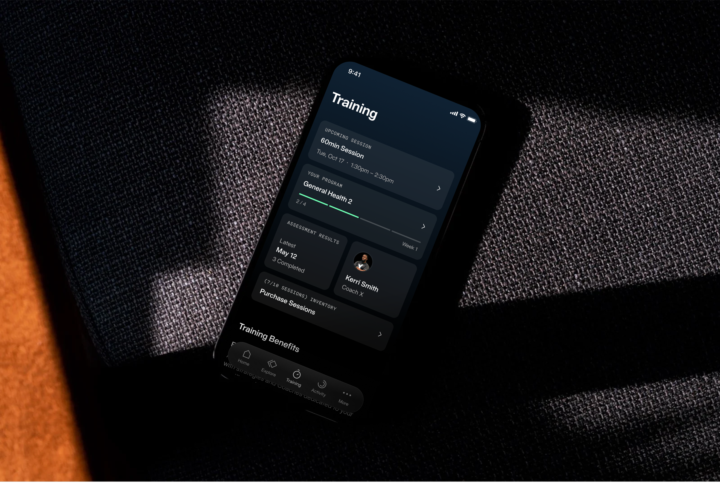
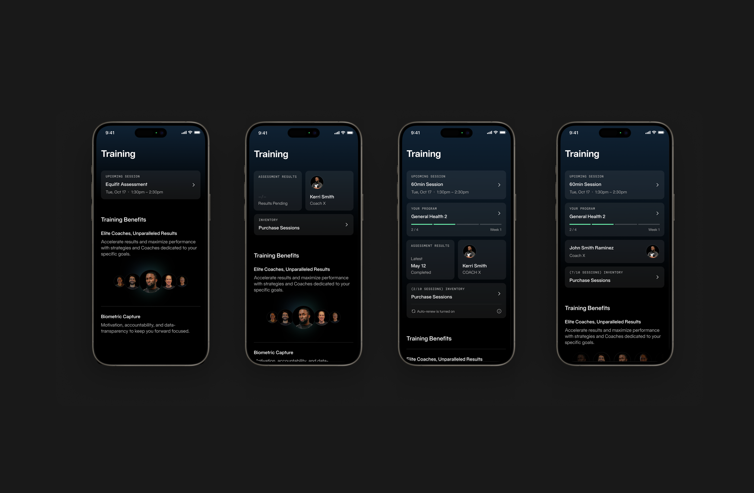
Adaptive Training Dashboard
This dashboard was designed as a modular system that supports different training scenarios while maintaining a consistent visual structure. The card-based layout adapts to different combinations of sessions, programs, coaches, and inventory, allowing the experience to remain clear and cohesive across many use cases.
The visual design relies on hierarchy, spacing, and subtle surface treatments to create structure. Soft gradients and elevated cards separate content, while typography scale guides attention to key information like upcoming sessions, progress, and remaining sessions. The goal was to create a flexible, scalable layout with a clear and premium visual language.
The visual design relies on hierarchy, spacing, and subtle surface treatments to create structure. Soft gradients and elevated cards separate content, while typography scale guides attention to key information like upcoming sessions, progress, and remaining sessions. The goal was to create a flexible, scalable layout with a clear and premium visual language.
Entry point highlighting sessions, benefits, and programs
Structured selection of club, date, time, and coach
Structured selection of club, date, time, and coach
Transparent summary, payment flow, and confirmation
The redesigned flow simplifies booking and purchasing, making decisions clearer and faster. It improves visibility of pricing and options, reduces friction across steps, and creates a more cohesive, premium experience aligned with the Equinox brand—while establishing a scalable foundation for future training features.
This project focused on turning a complex, multi-step process into a clear and guided experience. The challenge was balancing flexibility with simplicity—giving users control without overwhelming them.
As a lead, I focused on ensuring the flow felt intuitive, consistent, and intentional from start to finish—so users could move from interest to purchase with confidence.