Equinox Activity
Year
2025
Role
Lead Visual Designer
Platform
iOS, Mobile app
Focus
Data visualization, Behavior tracking, Progress & motivation Platform
Team
Product, Engineering, Data teams
The Activity experience was redesigned to help members understand progress, build consistency, and stay motivated over time. The goal was to unify check-ins, class history, and performance insights into a single system that transforms activity data into clear, actionable feedback
The Excisting Experience was;
Activity data was spread across disconnected surfaces, making it difficult for users to form a clear sense of progress over time. While metrics existed, they lacked emotional engagement and actionable insight, and visual inconsistencies further reduced trust and overall usability.
This resulted in low engagement with performance data and missed opportunities to reinforce habit-building.
As a Lead Designer my role was;
As Lead Visual Designer, I defined the visual language across all activity surfaces and led the design direction for calendar, check-ins, performance, and milestones. I worked closely with Product and Engineering to align on structure and feasibility, while ensuring consistency across components, typography, and motion. I also helped guide system-level decisions to maintain a cohesive and scalable experience across the platform.
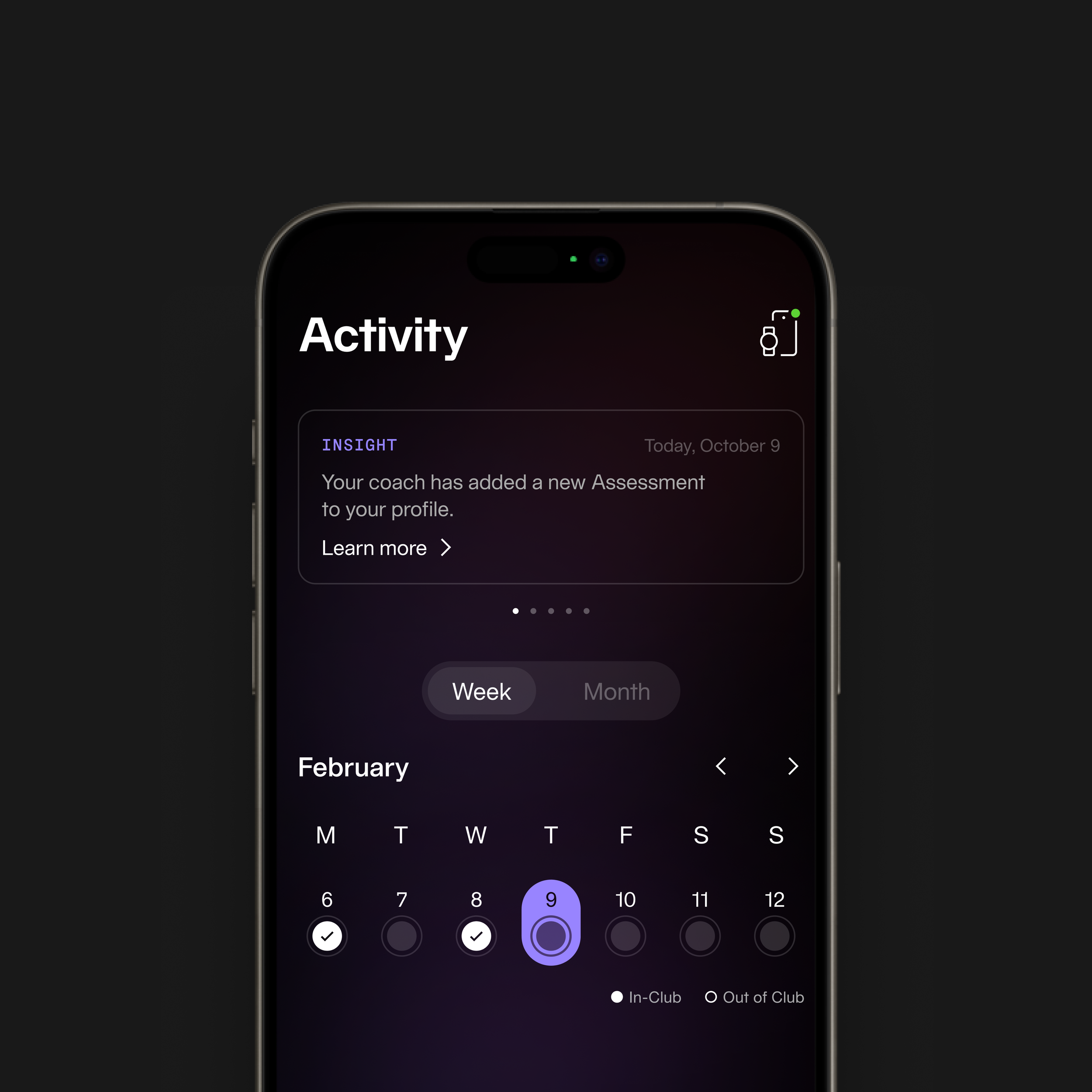
Structuring Time-Based Behavior
We structured the experience around time to help members quickly understand patterns, identify gaps, and track consistency. The calendar becomes a behavioral map—turning activity into a visible routine rather than isolated workouts.
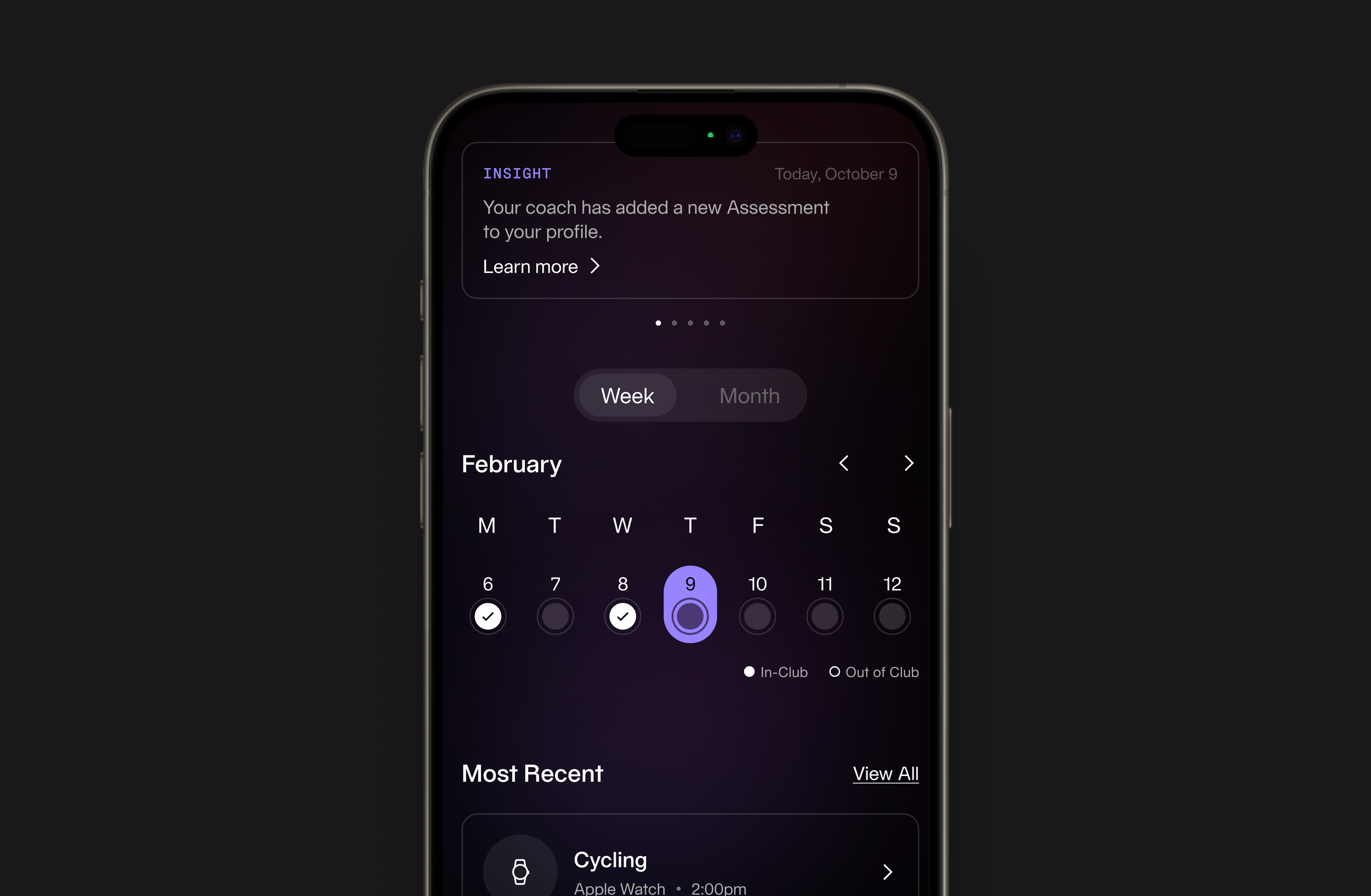
Progressive Data Disclosure
We used progressive disclosure to layer information—from calendar and recent activity to performance summaries and detailed session data—allowing both quick scanning and deeper exploration without overwhelming the user.
Design Principles
To guide the work, I established a few core principles:
Make progress visible
Progress and consistency should be immediately understandable at a glance.
Structure behavior around time
Fitness is built through consistency, so the experience should be organized around time, patterns, and trends—not isolated workouts.
Surface insights, not raw data
The interface should translate complex data into simple, actionable signals.
Design for different member types
The system needed to support a range of members—from beginners to performance-focused users—through personalization and modular content.
Build a system, not just screens
The solution needed to scale across new metrics, programs, and future features.
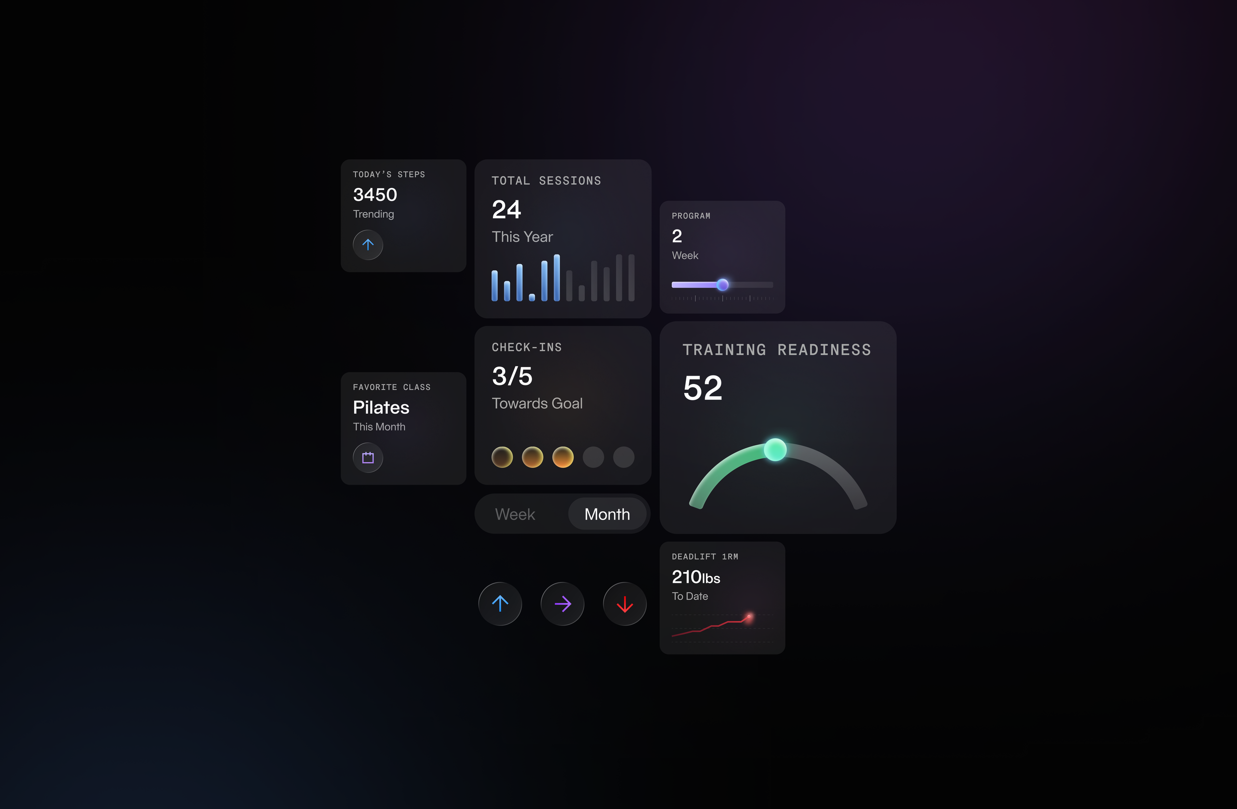
Systematizing UI Components
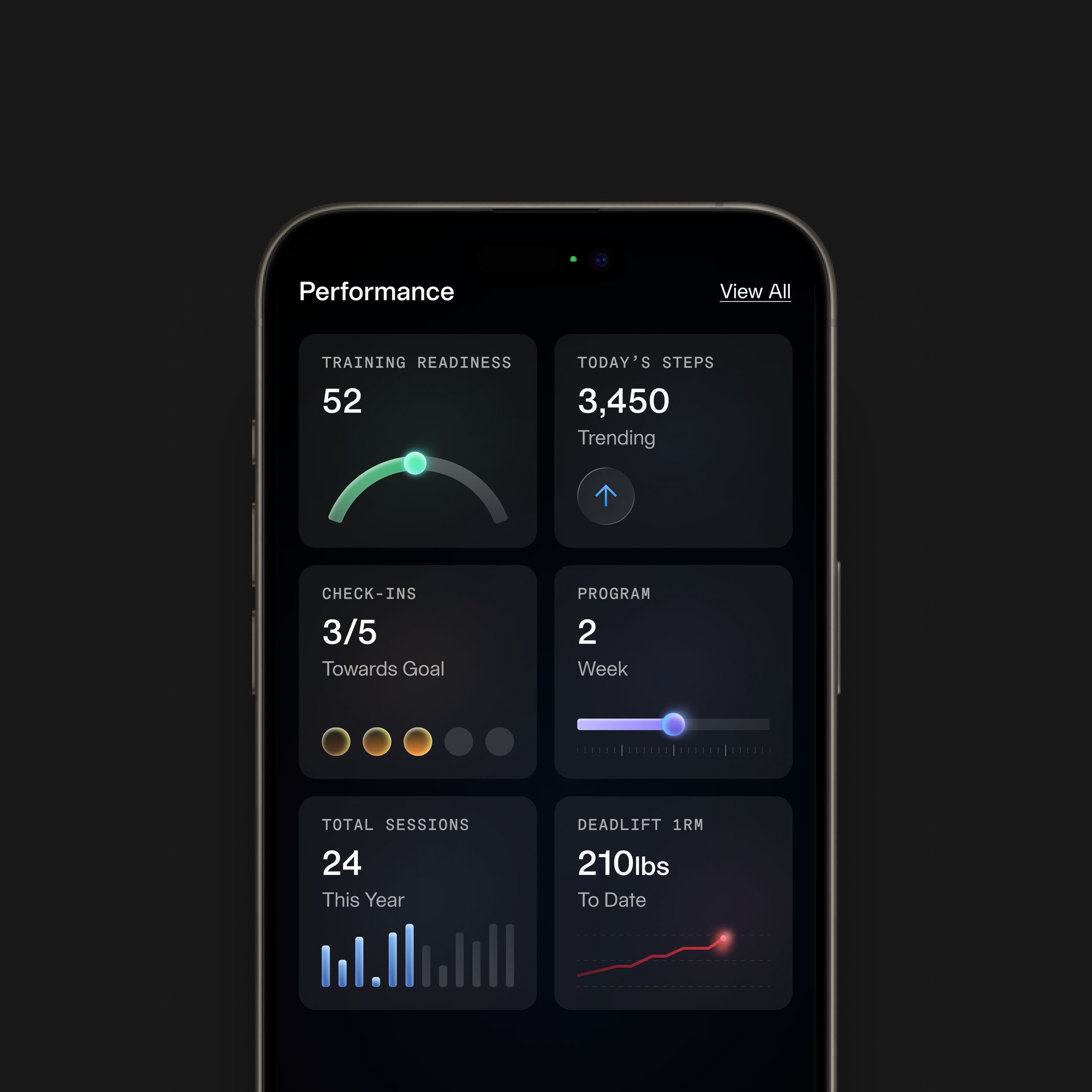
To ensure consistency and scalability, I built a reusable card-based system with standardized spacing, hierarchy, and typography—creating a flexible framework that could support multiple data types while reducing design and engineering overhead.
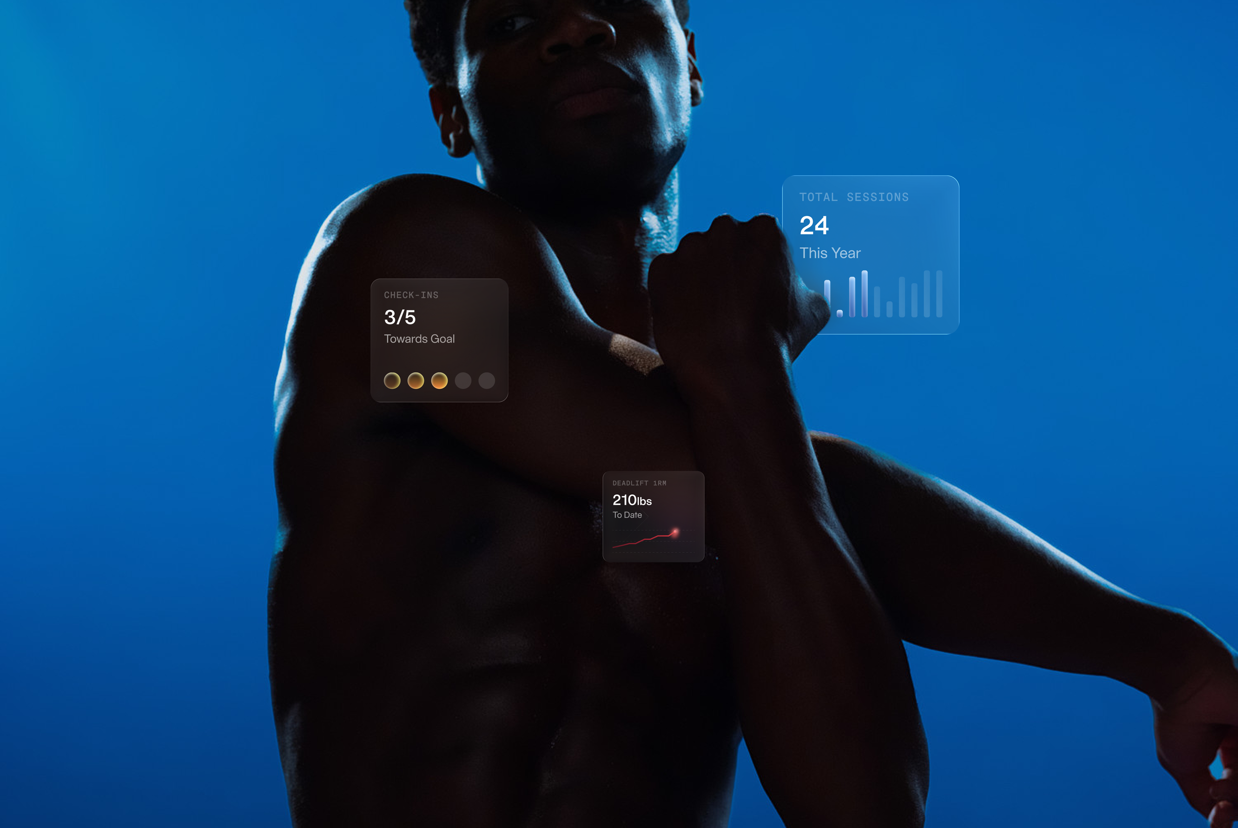
Premium Visual Language
The interface uses a dark, high-contrast foundation with subtle gradients and glow to elevate key metrics. Color is used intentionally to signal status and progress, while careful spacing and typography maintain clarity across dense data—creating a focused, premium experience aligned with the Equinox brand.
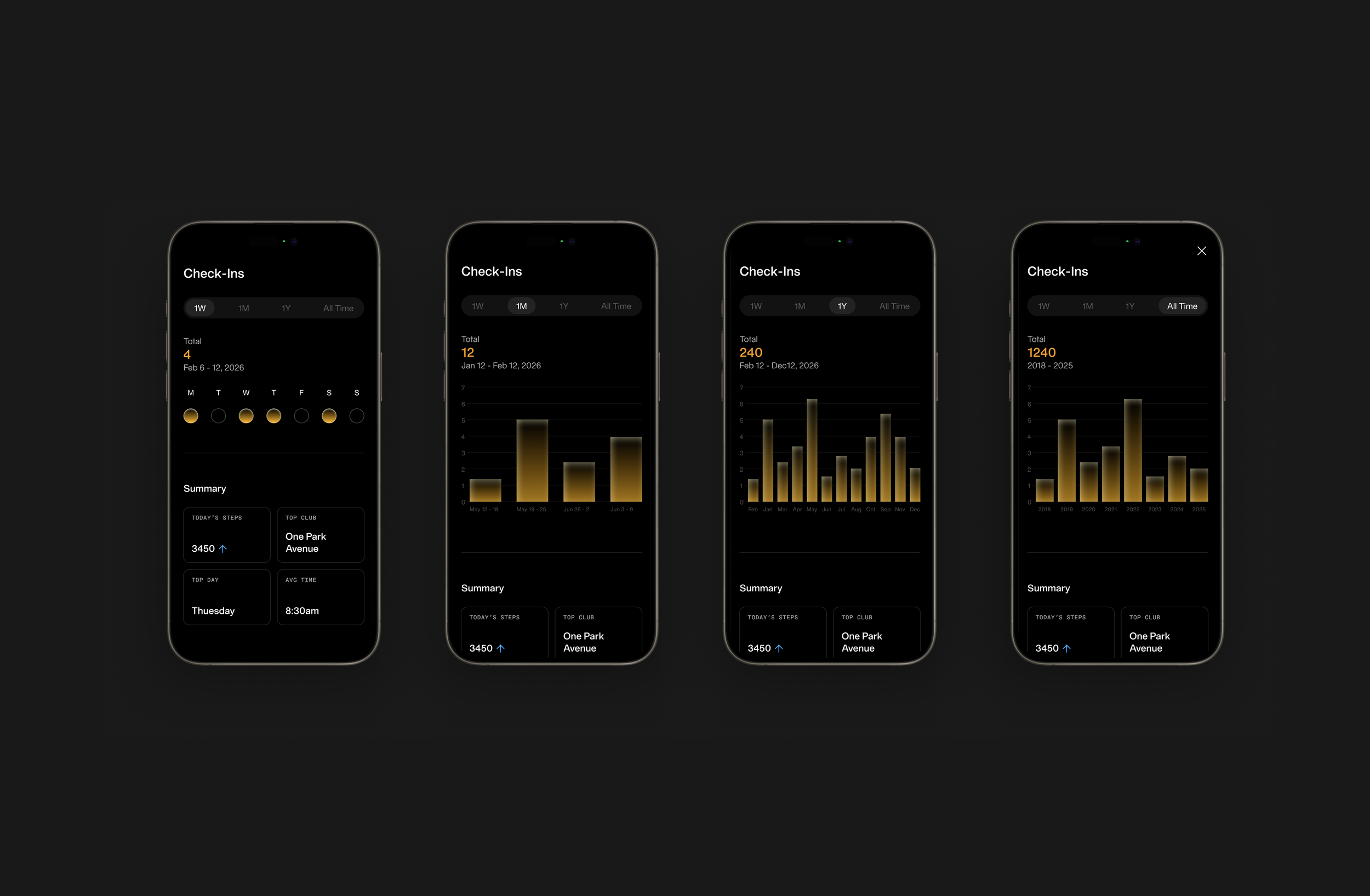
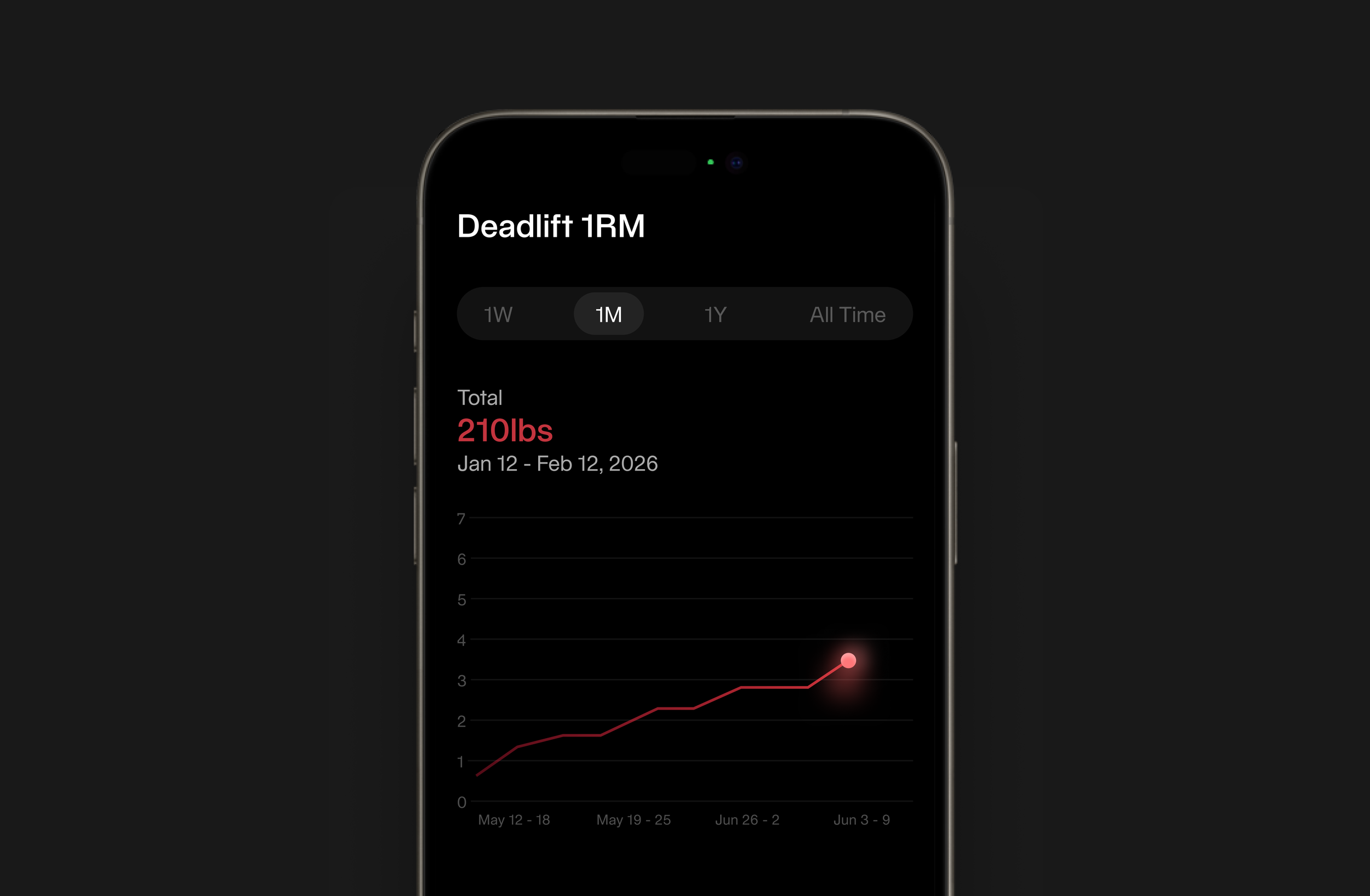
Check-ins Detail
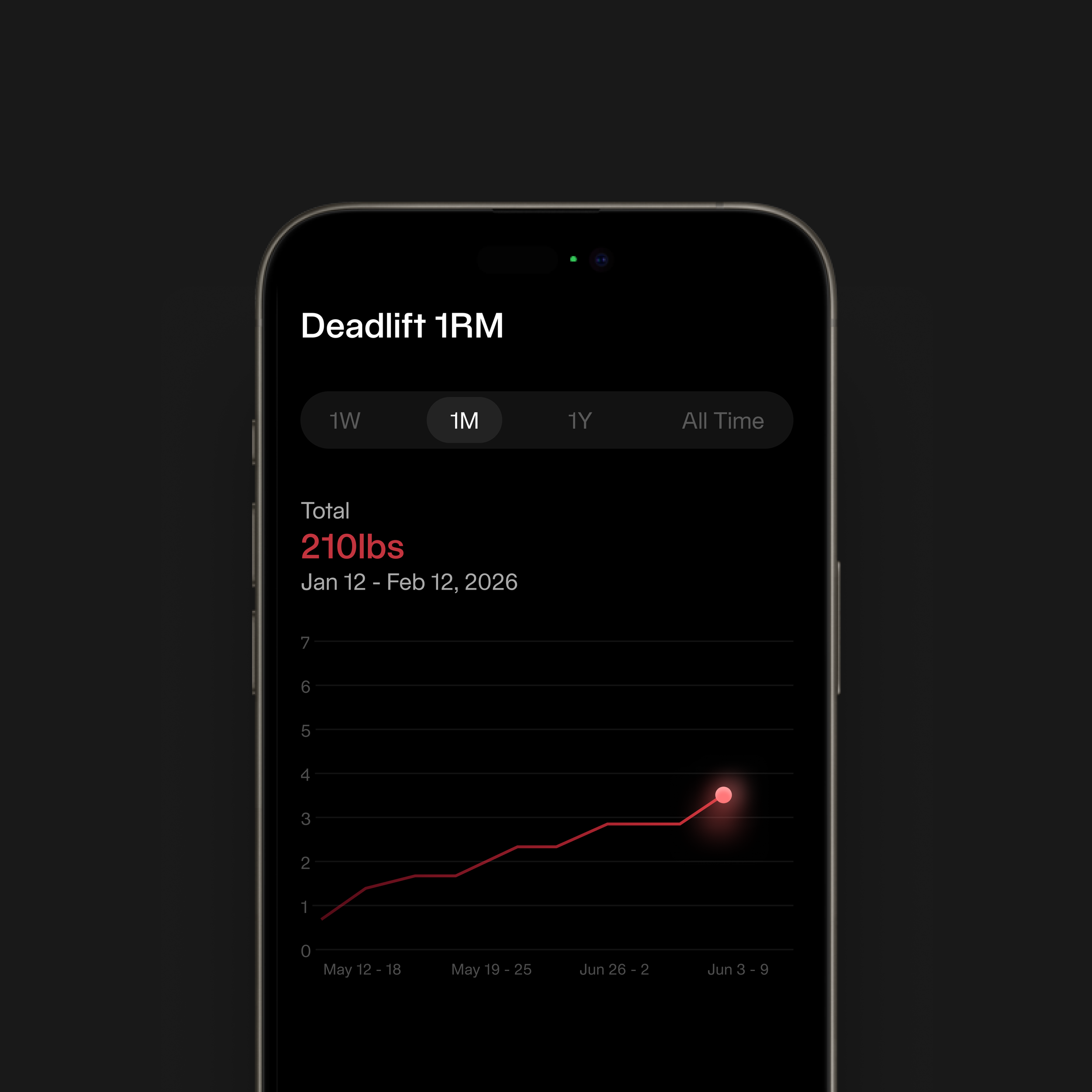
The check-ins detail view extends the activity experience by connecting high-level trends with deeper context. Users can move seamlessly across time ranges—weekly, monthly, and yearly—while visual charts surface patterns and consistency at a glance.
Structured summaries highlight key behaviors, and detailed session history provides quick access to individual workouts. Together, this creates a clear path from overview to insight, helping users better understand and reflect on their activity over time.
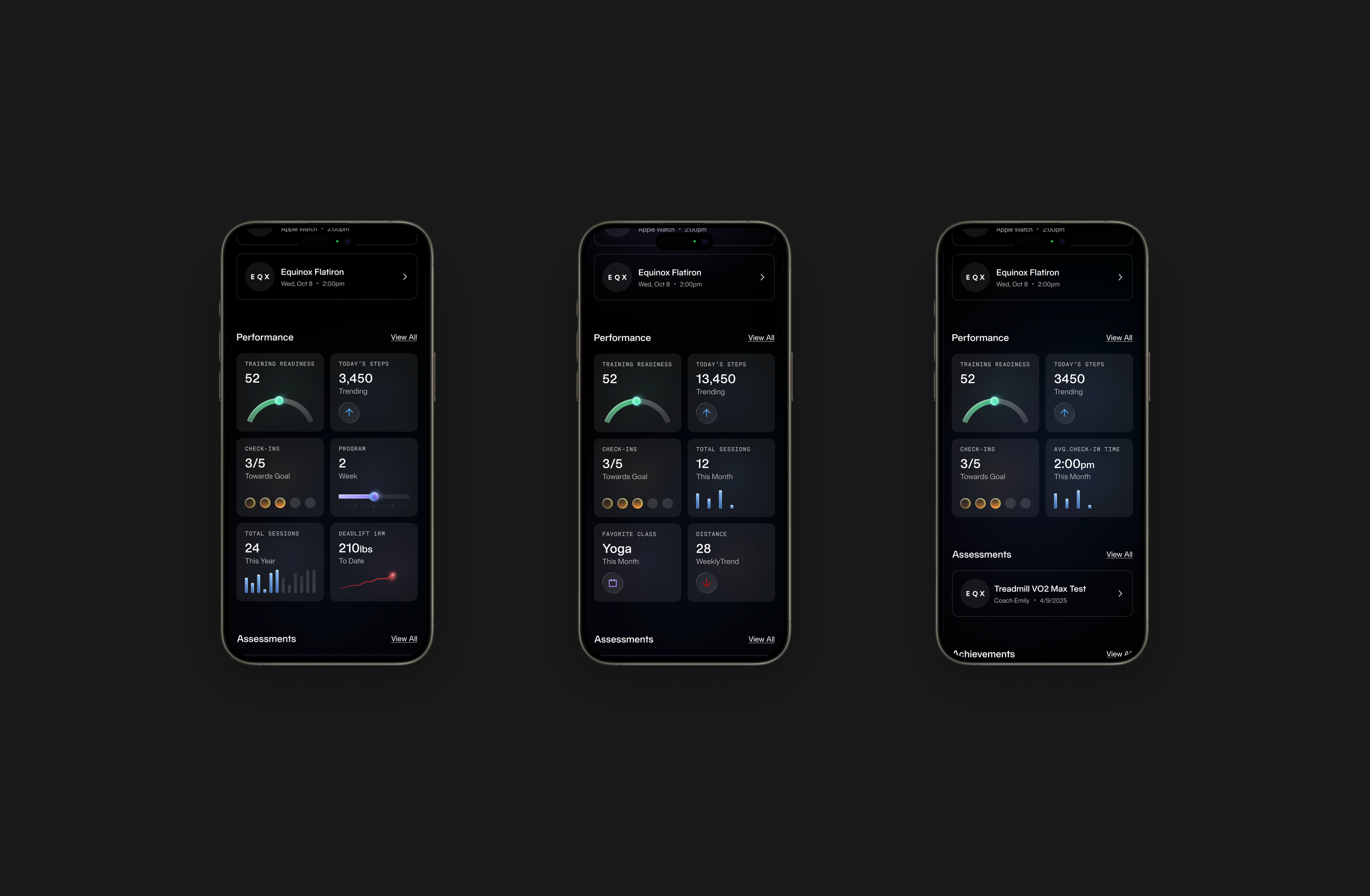
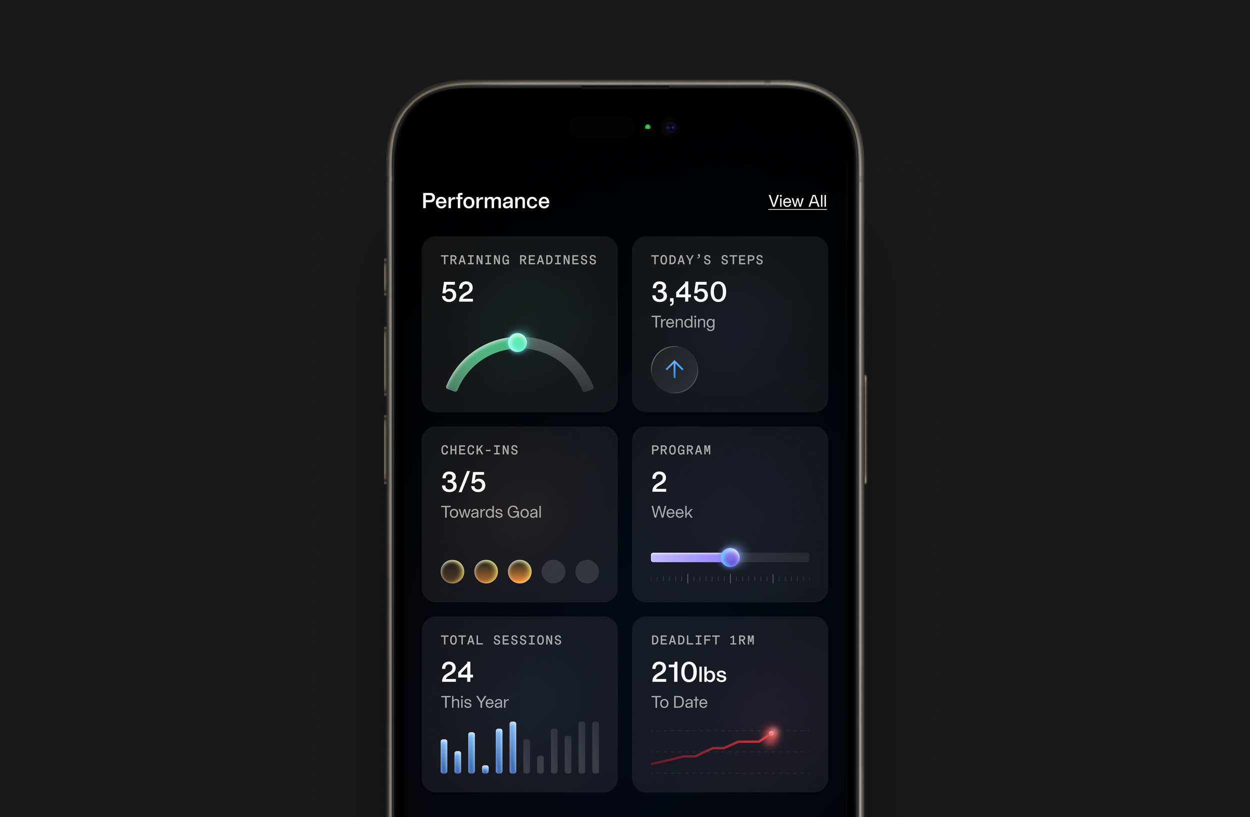
Performance Overview
Designed as a holistic dashboard, this experience brings readiness, activity, strength, and assessment data into a single, scannable view. The modular card system adapts not only to different member types and goals, but also to user preferences, allowing the interface to prioritize the metrics most relevant to each individual. The result is a clear daily snapshot of performance shaped by Equifit insights.
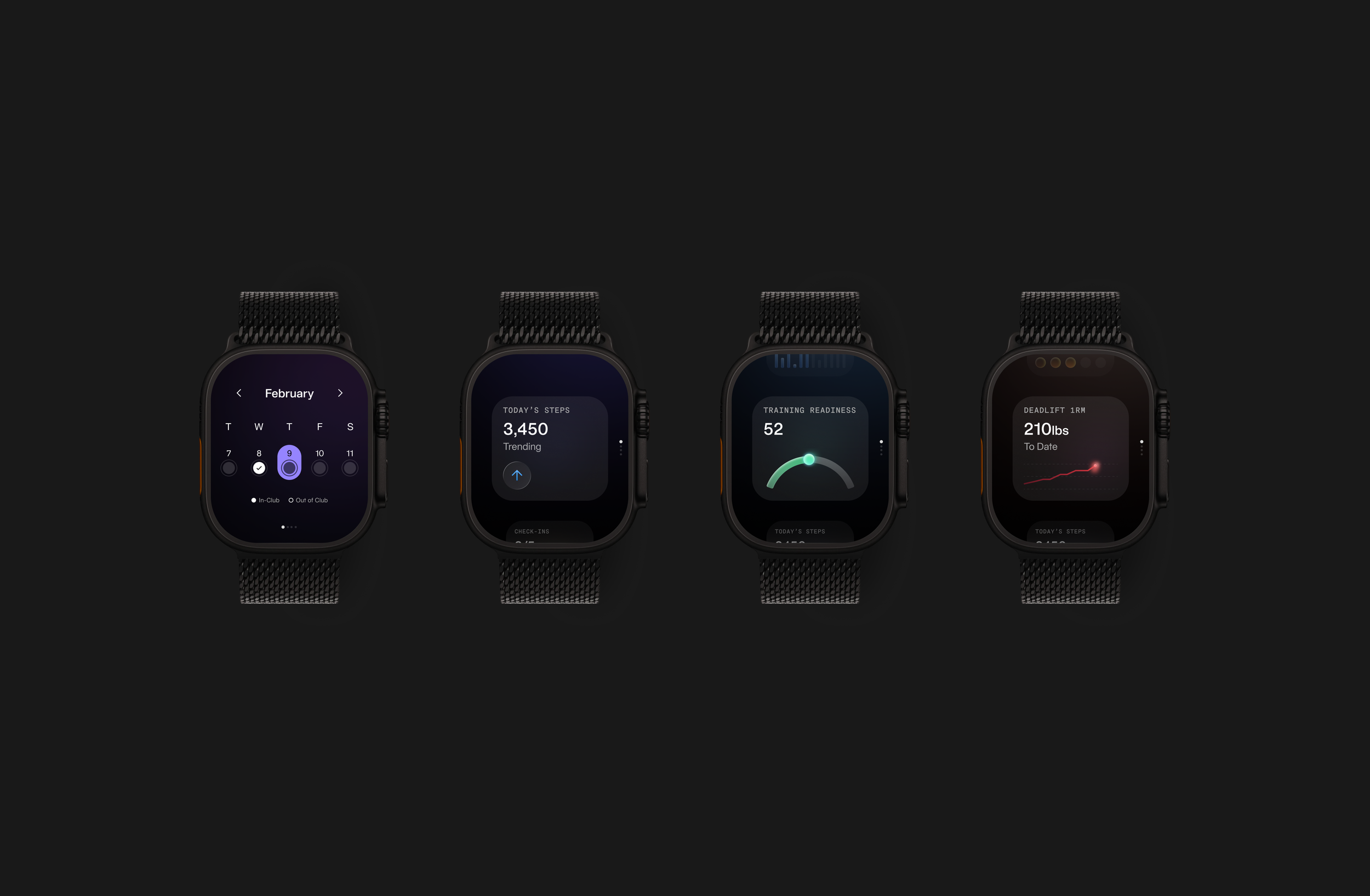
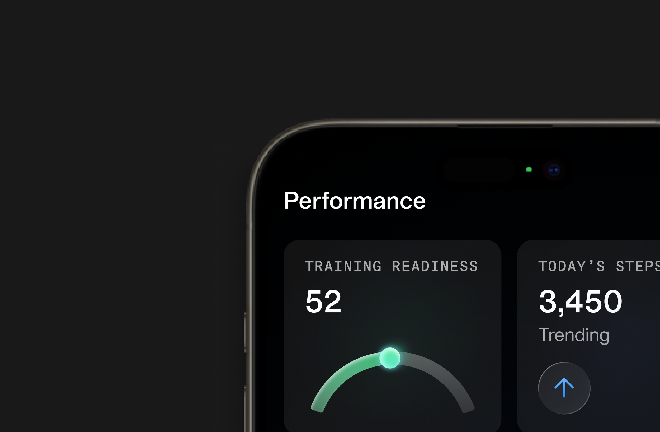
Extending the Experience to Apple Watch
We explored how the activity system could extend to Apple Watch, where constraints like limited screen size, glance-based interaction, and minimal input require highly focused, simplified UI. The interface prioritizes key metrics and uses clear visual signals to communicate status instantly. This ensures the system adapts across devices while maintaining a consistent visual language and feedback model.
A central hub for tracking behavior over time
A personalized dashboard of key fitness metrics
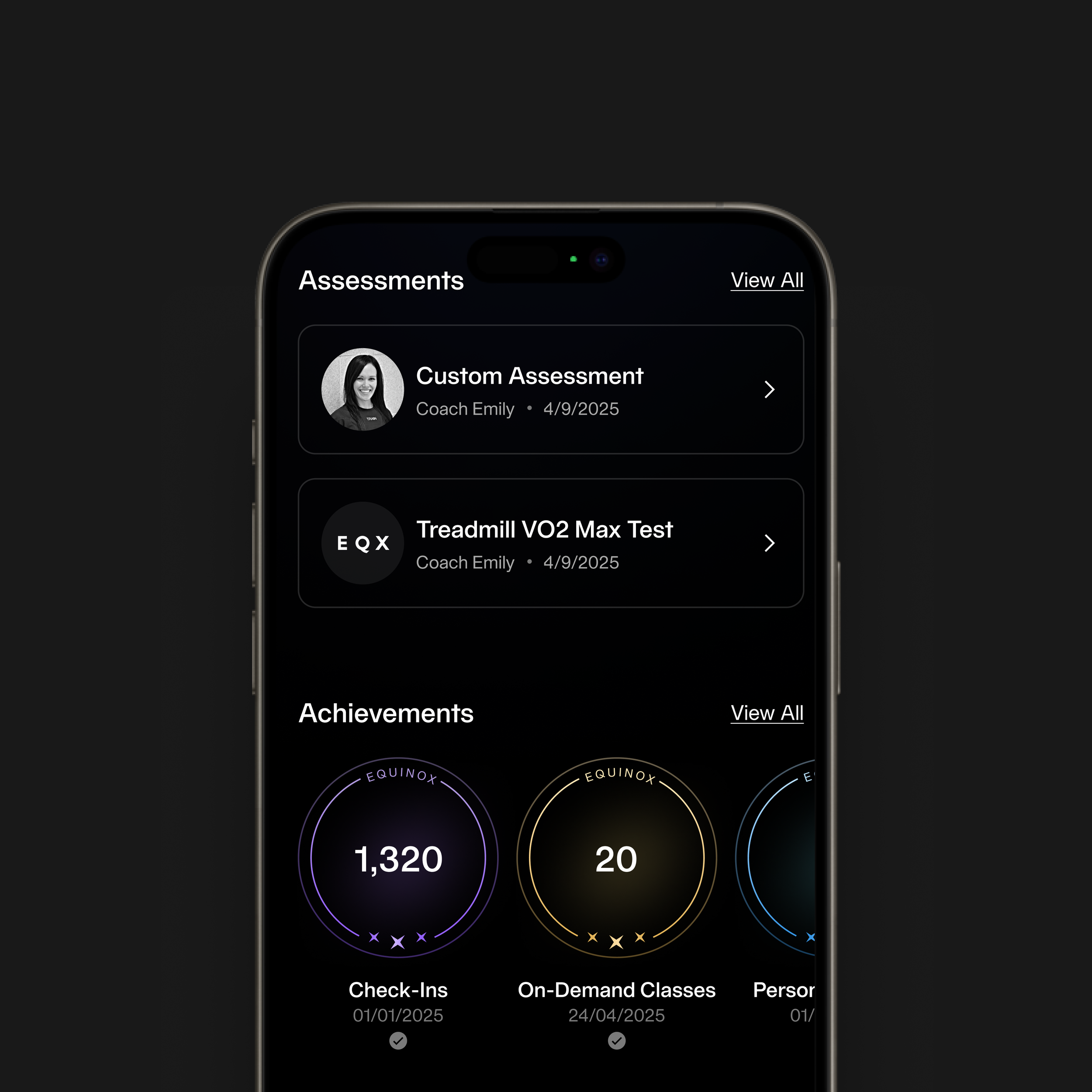
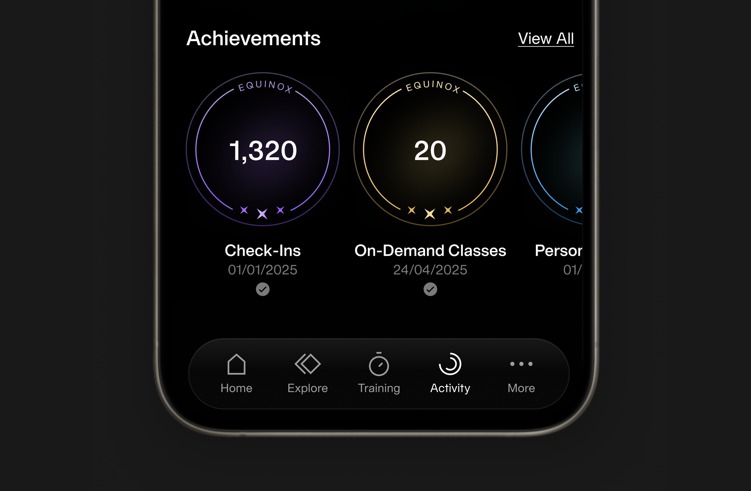
Visual summaries of trends, frequency, and achievements
Deep dive into individual workouts and stats
The redesigned experience improved clarity around user progress and engagement, making activity patterns easier to understand at a glance. Key metrics and habits became more visible and actionable, encouraging more consistent interaction with the product. At the same time, the system established a scalable foundation for future activity features while elevating overall product quality and aligning more closely with the Equinox brand.
This project was less about adding new features and more about making existing data meaningful. The challenge was balancing complex data with clarity and emotional engagement. My focus was to ensure every surface felt intentional, cohesive, and motivating—turning data into a tool for behavior change, not just information.